Pantone Colour of the Year 2024 - Peach Fuzz
It’s that time again; our New Year blog post is always a look at Pantone’s Colour of the Year, and this year is no exception despite a, shall we say, lukewarm reception at Kettlewell HQ to this year’s Colour of the Year!
So this year we’ll not only be introducing the Colour of the Year (COTY for short), but also discussing our favourite alternatives to add a little more zing to your outfit.
But first, the official version…
Peach Fuzz, an introduction
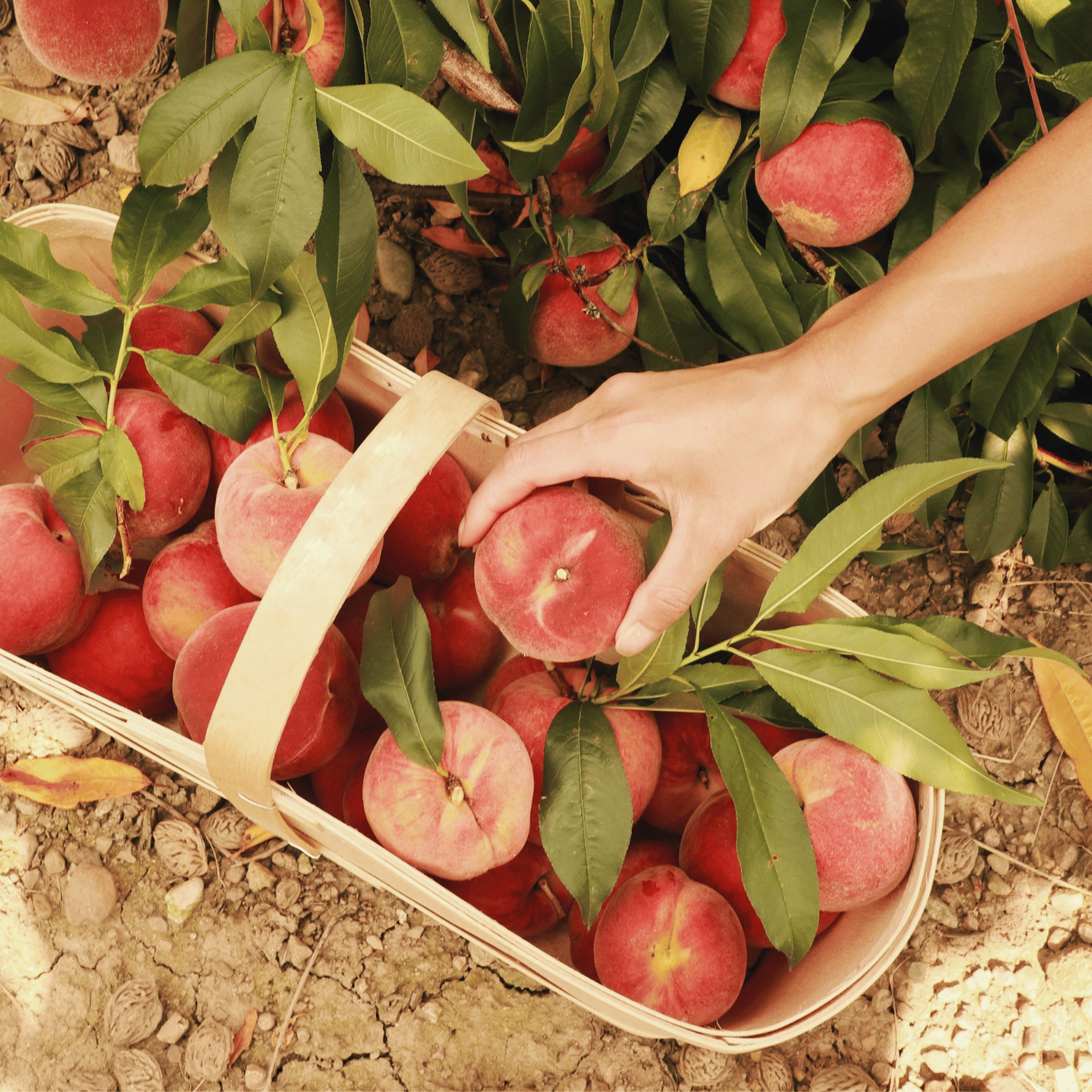
For 2024, Pantone has chosen Peach Fuzz as the COTY. Pantone describes it as ‘a velvety gentle peach whose all-embracing spirit enriches heart, mind and body’.
As a follow on from 2023’s much bolder Viva Magenta, it’s an interesting choice, reflecting a shift in consumers’ focus from noise and vibrancy to a calmer, more centred, more caring feel. It feels like a return to the softer, delicate shades of 2022 (soft purple Very Peri) and 2021 (light yellow Illuminating), after a perhaps less than successful attempt at a bolder and more brash shade in 2023.
With its usual poetic, slightly word-soup, approach to the COTY, Pantone describes Peach Fuzz as ‘a heartfelt peach hue bringing a feeling of kindness and tenderness, communicating a message of caring and sharing, community and collaboration… Peach Fuzz inspires belonging, recalibration and an opportunity for nurturing, conjuring up an air of calm, offering us a space to be, feel and heal and to flourish from.’
However you describe it, there is no getting away from the fact that Peach Fuzz is a light, warm, soft shade, with a sense of calm and delicacy about it.
Can I wear it?
Of course, the question we’re really interested in here at Kettlewell! And the answer is never going to be a no from us – we love and celebrate colour in all its forms. But we also recognise the power of wearing the colours that belong to your natural, harmonious palette. Wearing your best colours has the power to boost your mood, elevate your confidence, and make you feel like the best possible version of you!
All of which is why we’ve devised our insightful Colour Quiz to help you discover which palette of colours belongs to you – if you’re not sure which seasonal palette is yours, pop over and take the quiz before coming back to find out whether the Pantone COTY is for you!
Once you know your palette, it’s time to consider which palette Peach Fuzz sits in. With its warm, golden undertone, Peach Fuzz is emphatically a warm toned colour, with its lightest and clearest iterations sitting in the Spring palette, and softer, more muted variations in the Autumn palette. But if one of the cooler palettes – Summer and Winter – belongs to you, don’t panic! We’ve picked an alternative to Peach Fuzz for you to fall in love with (we’ve even picked alternatives for Springs and Autumns who find 2024’s COTY a little bit uninspiring!).
Let’s look at the tweaks and alternatives you could choose, and how you might style your version of Peach Fuzz.
PEACH FUZZ FOR SPRINGS
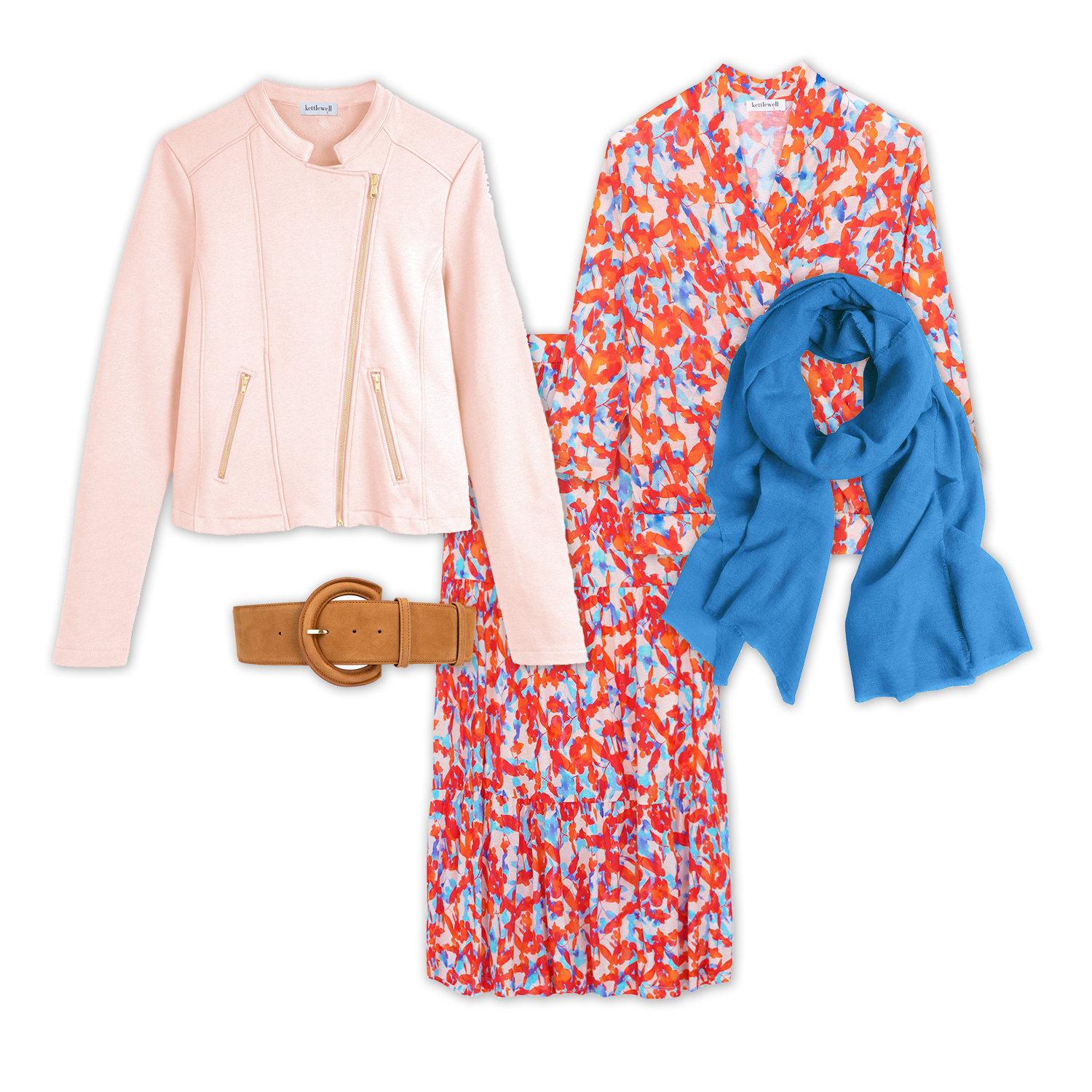
Shell Pink Chloe Jacket | Aqua Leaf Fia Print Blouse | Aqua Leaf Fia Print Skirt | Regatta Blue Cashmere Gauze Stole | Camel Lara Waist Belt
Style notes: Peach Fuzz needs only a little lifting to sit perfectly in the Spring Palette, and we love Shell Pink as a light, pretty interpretation of this COTY. Pair with feminine, pretty shades for a delicate look, or swap your Shell Pink for Peach Echo or Bright Apricot for a zingier alternative!
PEACH FUZZ FOR SUMMERS
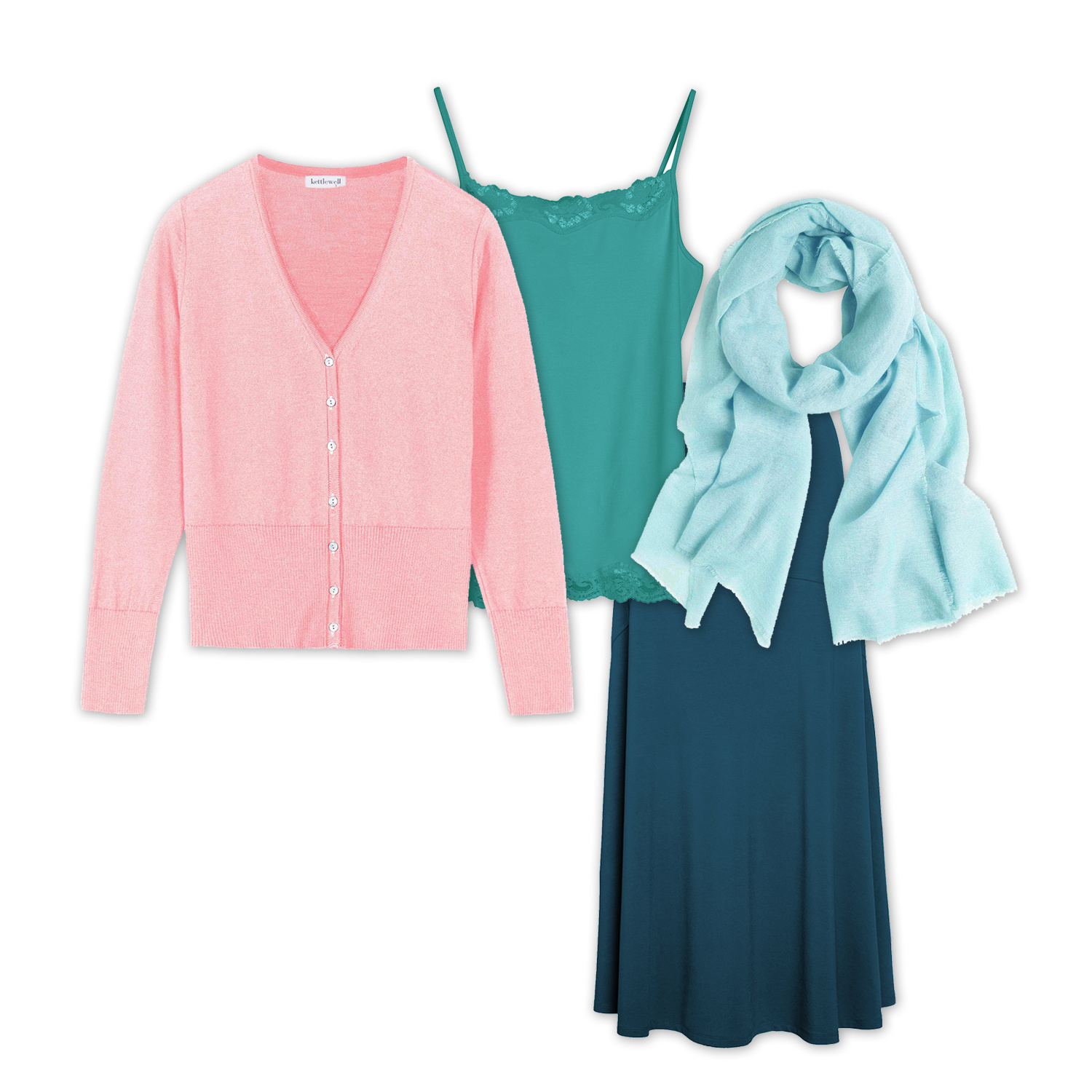
Peony Elle Cardigan | Sea Green Lace Camisole | Marine Navy Jersey Maxi Skirt | Duck Egg Cashmere Gauze Stole
Style notes: You need to find a cooler toned alternative to Peach Fuzz – we love Peony, which has the delicacy and prettiness of Peach Fuzz, especially paired with soft teals for an opulent finish. Want to go bolder? Berry Marl feels pretty but adds depth and elegance.
PEACH FUZZ FOR AUTUMNS
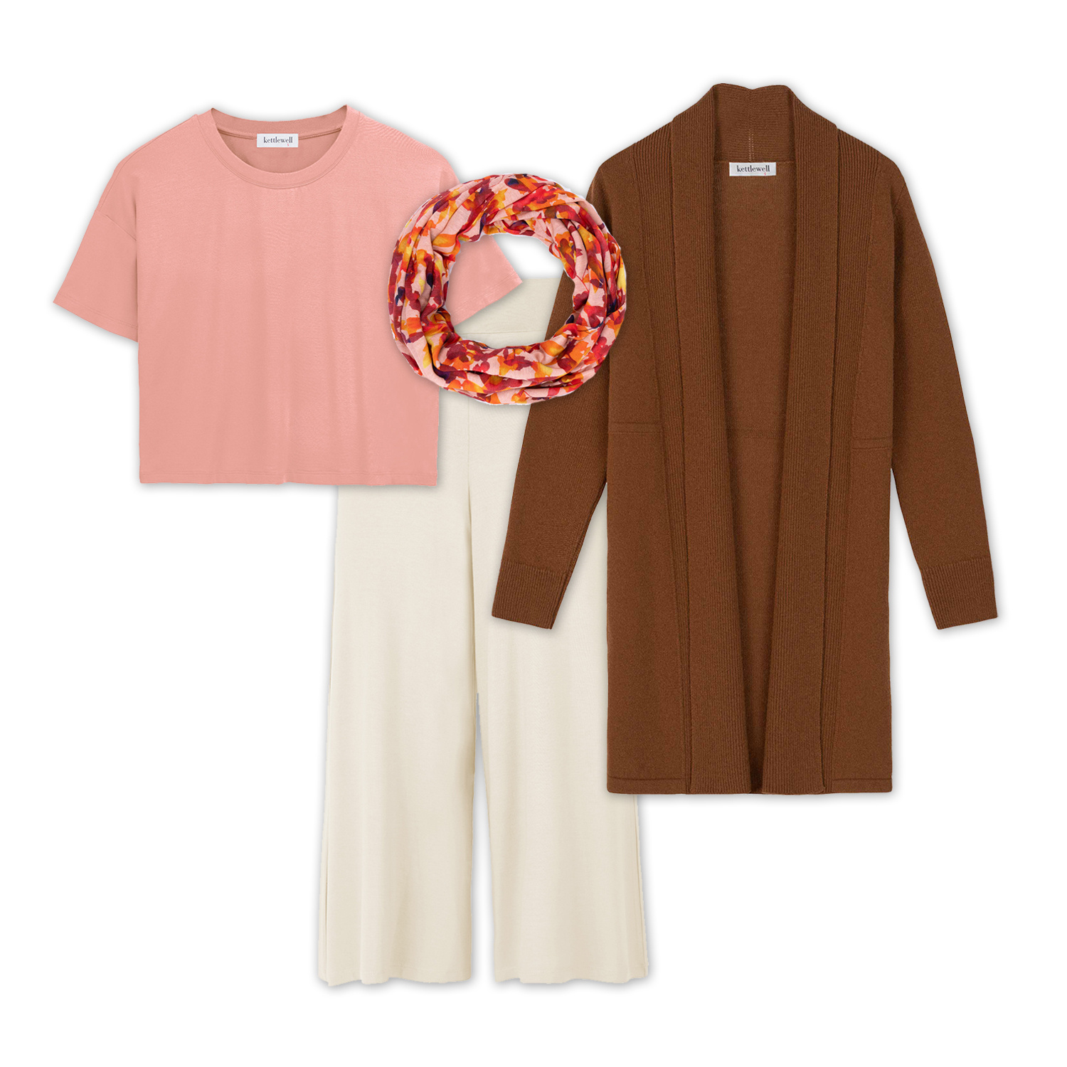
Rosewood Boxy Tee | Fudge Albany Coatigan | Chestnut Leaf Print Infinity Scarf | Stone Danni Culottes
Style notes: While you could opt for the lighter interpretations of Peach Fuzz as shown for Spring above, softer Rosewood makes a perfect version for Autumn’s slightly deeper palette. Pair it with warm rich browns for an effortless finish, and if you want to go a little bolder without sacrificing the prettiness, try swapping your Rosewood for Coral.
PEACH FUZZ FOR WINTERS
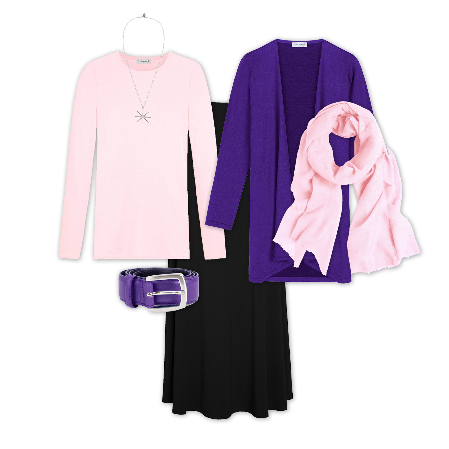
Pink Ice Hetta Long Tee | Jewel Lobelia Marta Wrap | Black Jersey Maxi Skirt | Pink Ice Cashmere Gauze Stole | Silver Dazzle Necklace
Style notes: Peach Fuzz is perhaps furthest from the Winter palette, with its soft and warm tones bearing no relation to Winter’s vibrant, zingy, cool toned palette. Pink Ice is your closest interpretation, offering a light delicacy rarely found in the Winter palette, and pairing it with Black enhances your Winter contrast and brightness. If you still prefer a more vibrant option, Shocking Pink offers lightness without sacrificing brightness!
Pantone’s Colour of the Year: a background
The Colour of the Year is a bit of fun, but it also has significant impact on the worlds of fashion, interiors and design, and can be seen as something of a steer on the global design mood for the year ahead.
The Colour of the Year is viewed as a trend forecast, which means that it is expected to influence consumer products and designs over the coming twelve months. Most companies don’t alter major brand colours, but many will incorporate the colour into advertising, as well as individual products. Clothes and homewares are the items that we most often recognise as being influenced by the Colour of the Year, but everything from mobile technology to kitchens is influenced by this colour trend forecast.
And if you’re someone who liked to consider yourself immune to the vagaries of trends, there is a fabulous, and famous, scene from the film The Devil Wears Prada which effortlessly demonstrates the impact these colour trend decisions have on our lives, whether or not we pay attention to them (if you haven’t seen it, pause for quick google of the film title and ‘Cerulean Blue’ to watch a clip, and get ready to feel both inspired and humbled by the power of colour).
As an amusing aside, Pantone is almost as famous for its flowery descriptions of the Colour of the Year as for the actual colour itself – this year is no exception, and you can read the full 2024 article on Peach Fuzz here https://www.pantone.com/uk/en/articles/color-of-the-year/what-is-peach-fuzz
Previous Colours of the Year
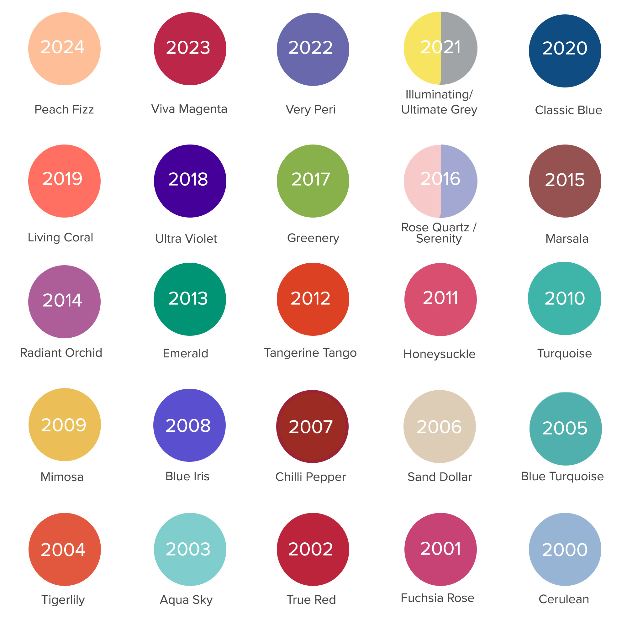
Of course, Pantone has been doing this for a while now. Ever since its inaugural colour of the year - which was, interestingly, Cerulean - in 2000, they’ve been trying to predict the societal and fashion mood of the year through colour. Here’s their predictions for the past 23 years…

Linda R on Jan 04, 2024 12:55 AM
I'll echo, Cathy’s comments about seeing the entire array of the COTY from Pantone. Thank you for the information.
I was analyzing the colors in an American and than a global context to to see if there was a pattern of connection to events or mood.
Likely not as I read the logic of the choices and somehow I cannot fathom Pantone’s arguments.
Good blog and very nice outfit suggestions.
Jayne on Jan 01, 2024 10:14 PM
Hi there I do find the Pantone so interesting. I wonder have their predictions been accurate wrt colour trends in clothes? Have you noticed at Kettlewell that they influence either yours or customer choices and trends in any way?
Cathy Stone on Dec 30, 2023 8:38 AM
Interesting to see the historic choices. More warm than cool, I'd say.