Pantone Colour of The Year - Viva Magenta
It’s the first blog post in 2023, which means that as well as looking forward to 12 colourful months ahead here at Kettlewell, it’s time for us to celebrate the Pantone Colour of the Year!
Before we get stuck into why Pantone chooses a Colour of the Year and how it impacts on us, let’s discover the first, most important and most exciting piece of information - 2023’s Colour of the Year, and how to wear it!
Viva Magenta - an introduction
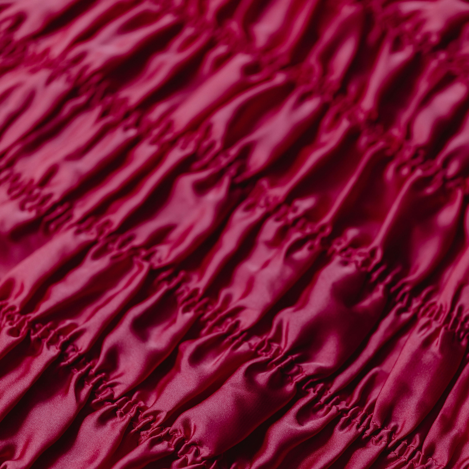
For 2023, Pantone have chosen Viva Magenta as the Colour of the Year. Pantone describes it as ‘An unconventional shade for an unconventional time’, and it’s certainly a stronger choice than those made in recent years (2021’s playful yellow ‘Illuminating’ and 2022’s soft purple ‘Very Peri’ both felt much softer, lighter and safer). A cool-but-not-too-cool toned shade of pink, Viva Magenta is rich, opulent and has a degree of depth, and has a winding back story. But before we worry about that, let’s look at the real question of the day…
Can I wear it?
Of course, the answer to ‘can I wear colour’ is never going to be a no from us at Kettlewell! We love and celebrate colour in all its forms, and are absolutely not here to be the colour police. But we also recognise the power of wearing the colours that belong to you, coming from the same sort of palette as your own natural colouring. Wearing ‘your’ colours has the power to boost your mood, elevate your confidence and above all make you feel like the best version of you, not a poor imitation of someone else. This is why we’ve devised our clever Colour Quiz, to help you discover which palette of colours belongs to you, and how you can wear them. If you haven’t yet taken the quiz, and you want to find out how you can wear Viva Magenta, pop over and discover your palette, then come back to learn all about how to wear this vibrant shade.
So what we really want to establish today is, does Viva Magenta sit in your colour palette, and if not, how can you tweak this Colour of the Year to work best for you?
And don’t be afraid to tweak! You’ll see all sorts of variations on the theme over the year - few people are as obsessive about precise tone as we are, so you’ll see everything from plum and musky rose to watermelon and bright coral being described as Viva Magenta over the course of 2023.
Of the four seasonal palettes that we divide all colour into, Viva Magenta really sits on the cusp of the Summer and Winter palettes. Viva Magenta is cool (blue) in undertone, but not excessively so, which means that it sits close to that ‘neutral’ (ie not warm, not cool) line. So although it’s not going to be brilliant for those who have a warm undertone to their skin (Springs and Autumns), it’s not going to take a huge amount of tweaking the original colour to make it work. It’s also a relatively strong colour, so although it has the slight softening that perhaps makes it just shift into being Summer colour, rather than a (fellow cool undertones palette) Winter colour, again it won’t take much tweaking to persuade it to sit comfortably in the brighter Winter palette.
Let’s look at the tweaks you could make, and how you might style your version of Viva Magenta.
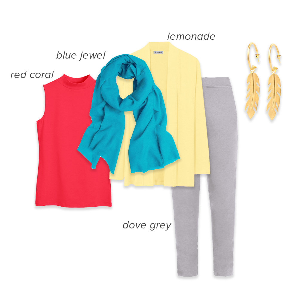
Style notes: Springs will need to make the biggest leap from Pantone’s original 18-1750 (the, slightly uninspiring, formal code for Viva Magenta) in order to make it work for your warm, light and clear colouring. Opt for colours that share the vibrancy and some of the depth of Pantone’s version, but add a little of the warmth that really brings you to life - we love Red Coral and Watermelon as your versions of Viva Magenta, especially when paired with classic Spring colours like Lemonade and Aqua.
Viva Magenta for Summers
Style notes: Viva Magenta is right at home in the Summer palette, but many Summers will find it a little stronger than other colours in this soft, smoky, blue toned palette, sitting as it does somewhere between zingy Lollipop and softer Pink Raspberry. If you’re worried that this full on pink is a little much, pair it with similar, tonal colours to keep the colour, and the rest of your outfit, feeling like it truly belongs to you.
Viva Magenta for Autumns
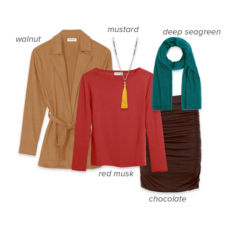
Style notes: Viva Magenta is a cool (blue) toned colour, but there are several Autumn colours that tap into the same adventurous, unconventional mood of Viva Magenta while retaining Autumn’s warmth and golden yellow undertone. We love Musk Red for a red that feels a little different from the norm, but if you prefer an even more warm toned red, Brick Red offers another slightly soft, unexpected option that works for even the warmest skin tones. Red Pear is another Autumn option.
Viva Magenta for Winters
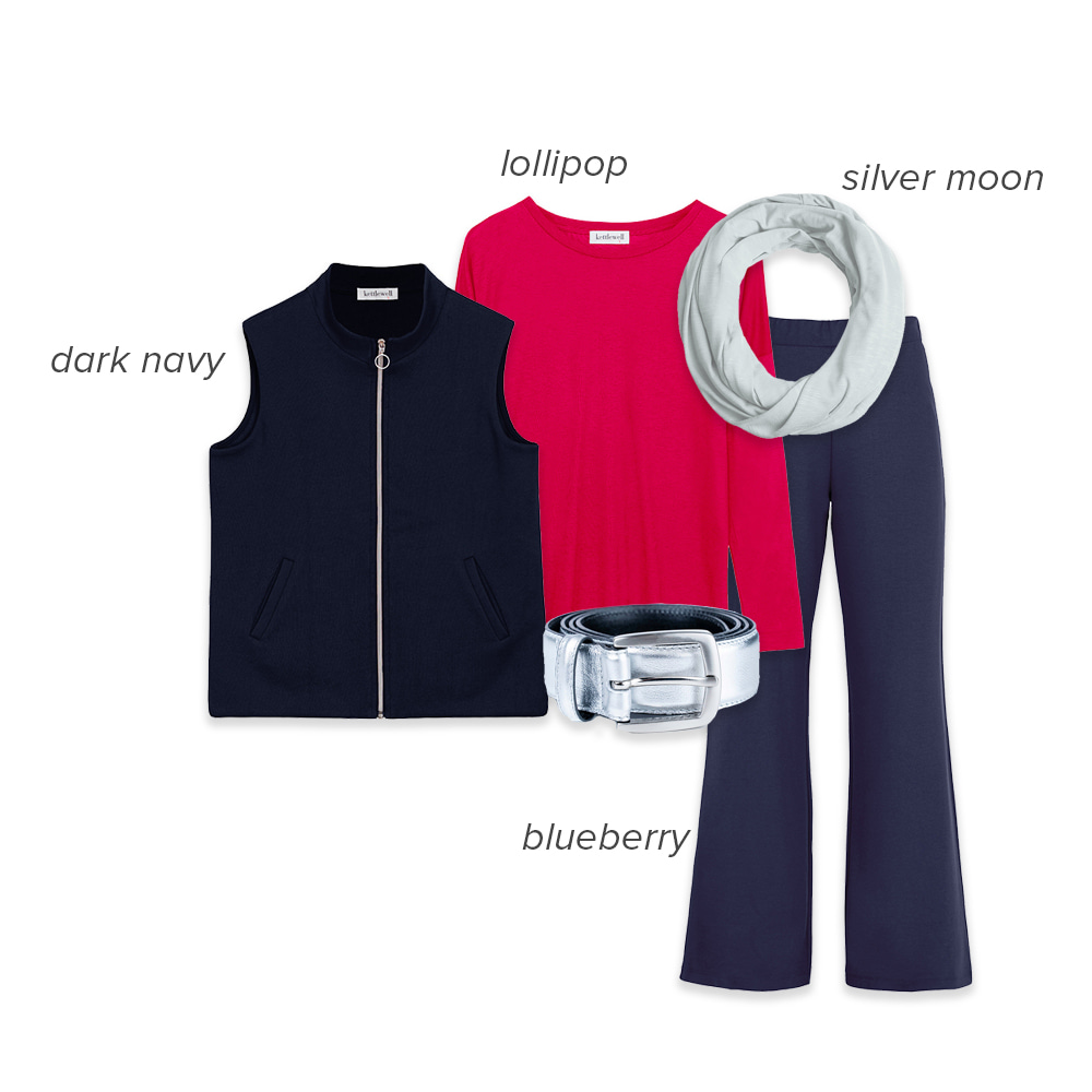
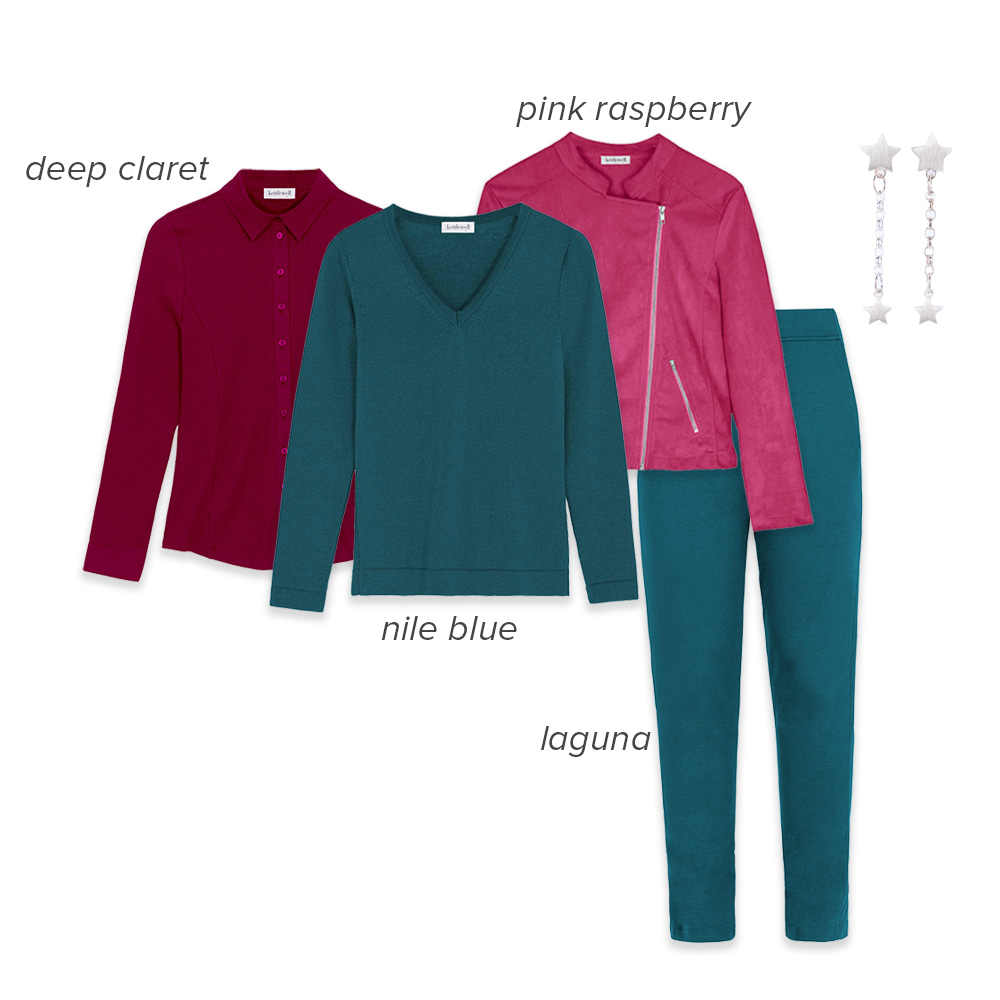
Style notes: Lollipop, our favourite Kettlewell match for Viva Magenta, works brilliantly for Winters, and is brightened up even more with some clever colour combining. As an alternative to Navy, we also love pairing it with cool toned Deep Claret (you can’t beat a little red and pink colour blocking, and it feels bold without being over the top), maybe with a splash of Pink Ice to bring in the contrast that works so well for you.
Viva Magenta - a story of colour
Viva Magenta is inspired by crimson red, created from the cochineal beetle, and with these plant-based origins aims to acknowledge feelings around climate change, sustainability and land protection, as well as an increased desire to support our physical bodies and emotional wellbeing.
The strength of the colour - and red is associated with passion, strength and force of character - is intended to inspire us to move forward into whatever challenges lie ahead with ‘confidence and bravery’, in both the digital and real world.
In short, Viva Magenta feels like a colour that tries to balance the natural world with the digital, and strength and progress with global uncertainty. It is clear that Pantone is avoiding any language that comes across as too frivolous and upbeat around this colour, but hopes to inspire positivity and certainty with the choice of a strong, definite colour, in a time when little feels absolute. It’s a colour to stand out in, to stand up and be counted in, and above all to embrace life in.
The importance of Pantone's Colour of the Year
The Colour of the Year is a bit of fun, but it also has significant impact on the worlds of fashion, interiors and design, and can be seen as something of a steer on the global design mood for the year ahead.
The Colour of the Year is viewed as a trend forecast, which means that it is expected to influence consumer products and designs over the coming twelve months. Most companies don’t alter major brand colours, but many will incorporate the colour into advertising, as well as individual products. Clothes and homewares are the items that we most often recognise as being influenced by the Colour of the Year, but everything from mobile technology to kitchens is influenced by this colour trend forecast.
And if you’re someone who liked to consider yourself immune to the vagaries of trends, there is a fabulous, and famous, scene from the film The Devil Wears Prada which effortlessly demonstrates the impact these colour trend decisions have on our lives, whether or not we pay attention to them (if you haven’t seen it, pause for quick google of the film title and ‘Cerulean Blue’ to watch a clip, and get ready to feel both inspired and humbled by the power of colour).
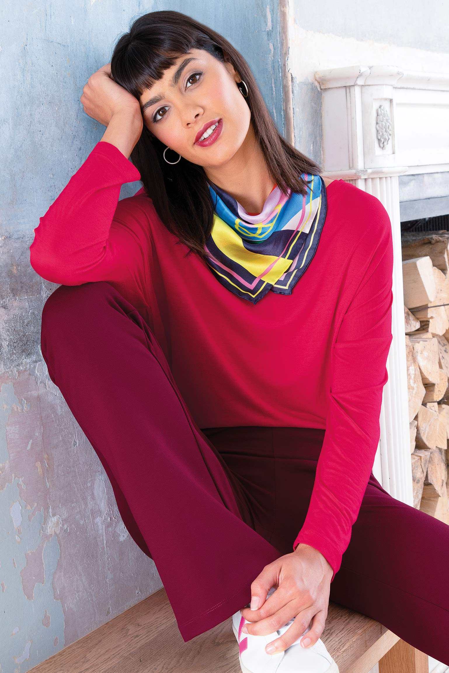
Lollipop Talullah Top | Deep Claret Betsy Ponte Trousers | Multi Wave Sia Silk Scarf
Why Viva Magenta?
So if this colour has such important and impact, why did Pantone choose Viva Magenta over all the millions of available colours out there?
In their own words, Viva Magenta ‘vibrates with vim and vigour’. Described as brave and fearless, Pantone states that its ‘exuberance promotes a joyous and optimistic celebration, writing a new narrative’.
It must be noted that Pantone is almost as famous for its flowery descriptions of the Colour of the Year as for the actual colour itself, and 2023’s colour is no exception, with Viva Magenta described as ‘an animated red that revels in pure joy, encouraging experimentation and self-expression without restraint, an electrifying and a boundless shade that is manifesting as a stand-out statement’. But once you wade through the half dozen or so paragraphs of similar prose, a mood of the colour does begin to emerge. This is an unconventional colour, for unconventional times. No safe grey or blue this year, but also not a playful pink or yellow. Instead, Viva Magenta shows strength and intention, a colour that, Pantone hopes, offers a sense of strength and optimism in the face of yet another year of the unknown.
Whatever 2023 throws at us, it seems unlikely that Viva Magenta is suddenly going to feel inappropriate. It’s a trend forecast that feels able to weather the global uncertainty ahead, and that will, we hope, encourage us all to celebrate the magic of colour all year long.
Previous Colours of the Year
Of course, Pantone has been doing this for a while now. Ever since its inaugural colour of the year - which was, interestingly, Cerulean - in 2000, they’ve been trying to predict the societal and fashion mood of the year through colour. Here’s their predictions for the past 22 years…
2022 - Very Peri 17-3938
2021 - Illuminating 13-0647 and Ultimate Grey 17-5104
2020 - Classic Blue 19-4052
2019 - Living Coral - 16-1546
2018 - Ultra Violet 18-3838
2017 - Greenery 15-0343
2016 - Rose Quartz 15-3919 and Serenity 13-1520
2015 - Marsala 18-1438
2014 - Radiant Orchid 18-3224
2013 - Emerald 17-5641
2012 - Tangerine Tango 17-1463
2011 - Honeysuckle 18-2120
2010 - Turquoise 15-5519
2009 - Mimosa 14-0848
2008 - Blue Iris 18-3943
2007 - Chilli Pepper 19-1557
2006 - Sand Dollar 13-1106
2005 - Blue Turquoise 15-5217
2004 - Tigerlily 17-1456
2003 - Aqua Sky 14-4811
2002 - True Red 19-1664
2001 - Fuchsia Rose 17-2031
2000 - Cerulean 15-4020

Ruth on Dec 31, 2022 9:00 AM
Just watched the cerulean blue clip - brilliant. Must watch the whole movie now. Not sure about this Viva Magenta colour but willing to give it a go and watch the ‘prediction’ for its influence on society pan out over the year.
Rebecca Young on Dec 30, 2022 8:05 PM
How very interesting all that information is! Thank you for sharing it. Looking forward to a 'viva' year!!!
Freda Morse on Dec 30, 2022 6:13 PM
As a "summer" I wonder if Kettlewell has any garments planned that will actually be created in Pantone Viva Magenta? If so our colour palate will be the "princess" rather than the "cinderella" (reference a recent review comment) of Kettlewell for a whole year.