A brief history of colour analysis

Whether colour analysis is a 'real thing' is a debate often thrown my way by people who think it's a waste of time, money and energy. Obviously I believe it's a real thing because I see it, and my clients see it, on a daily basis, but when I trained in colour analysis I was also surprised by how much of a lineage of science and philosophy colour analysis has.
The history of colour analysis is (if you ask me) an endlessly fascinating subject. Not just for those of us who are passionate about it as a process, but also to help those who doubt its worth to understand that yes, it is in fact a real thing.
Colour has been viewed over the centuries by physicists, philosophers, mathematicians and artists and all have come up with their own theories about how colours interact with each other, with our senses and with the world around us. Light and sound both have frequency and wavelength. We have known for centuries that when we hear two notes played in harmony, it sounds pleasant, but when we hear discordant notes the sounds jars and makes us feel uncomfortable. The same applies to light and, therefore, colour. When a colour combination is harmonious, whether that is with another colour or with someone's skin tone, it is pleasing to view, making a person look healthy and clear skinned. But when that colour is a 'discordant note', it makes for something that is visually uncomfortable, which in the context of someone's complexion means a person looking unhealthy, tired or even a bit jaundiced. Artists began to research this effect long before colour analysts, knowing that painting a portrait was far more successful if the palette was in harmony, with the subject's surroundings and outfit complementing their skin and hair tones.
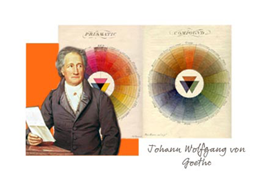
Picking a start point for the history of colour analysis itself is almost impossible - we have been considering colour almost as long as we have been a civilised species, from war paint and royal robes to interior design and workplace uniforms. However, the generally accepted 'year dot' figurehead for colour analysis is a chap called Johann Wolfgang von Goethe, who researched and wrote extensively about colour with particular reference to perceptions of colour and how we interact with it, rather than from a purely scientific viewpoint (as previous researchers, notably Sir Isaac Newton, had done. I'm not going to start talking about Newton's research into colour because we'll be here for the rest of the week working our way forwards from the seventeenth century).
Goethe, born a mere two hundred and fifty years ago, wrote extensively on colour from a philosophical and subjective viewpoint, considering colour not from a purely scientific perspective as Newton did, but from a philosophical one, looking at how we interact with colour, how our perception shifts depending on combinations, relative light or darkness and a million and one other human factors that affect colour.
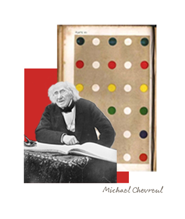
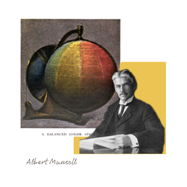
Our next player is a more scientific one; Michael Chevreul, born in 1786, was a chemist who examined at length the effect of putting different colours alongside one another. His work formed the scientific basis that many artists used in the coming century. In the US, the Albert Munsell, born in 1858, began to define colours using three characteristics - hue (cool/warm), value (dark/lightness) and chroma (clear/muted). These two strands of colour theory - the scientific and the philosophical, were running alongside each other for centuries, until....
Johannes Itten developed and refined the colour theory that had come before. Itten was, as part of a long and varied career, a pivotal member of the influential Bauhaus school of art in Germany in the 1920s. He taught a foundation course in the study of colour and form which all student were required to take. The theories he expounded and taught as part of this course are still used by artists today, and made up and developed his colour theories.
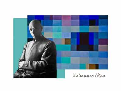
As well as deepening our understanding of how colours interact with each other, and with light and dark, we also have Itten to thank for beginning to describe colours as 'warm' and 'cool' and for dividing up palettes of colours into seasons. Although he did not translate this to colour analysis, Itten did note that when asked to paint a 'season', each student chose a palette of colours that was easily recognisable as belonging to the season in question, such as a light, bright, warm toned palette for spring. He also noted that when asked to paint harmonious colours, his students would tend to paint with colours that matched themselves (such as a blonde, blue eyed student painting with very clear, light tones). Itten really fused both the scientific (objective) and more philosophical (subjective) historical views of colour theory and perception, which paved the way perfectly for our next key player.
The man we really have to thank for translating colour theory into a workable colour analysis system is yet another artist, an American this time, by the name of Robert Dorr. Working in a time when colour film was on the rise and people were more aware of the impact of colour, he used Itten's theories on seasonal groupings to divide people up into Key I (cool) and Key II (warm) skin tones, each of which were assigned a palette of colours. The deciding colours to establish whether an individual fell into a Key I or a Key II skin tone were orange (which didn't appear in Key I, so if a person looked good in it, signified a Key II skin tone) and magenta (which didn't appear in Key II).
In the 1980s, all of this research and development, combined with the ability to precision dye analysis drapes, garments and make up colours, led to the launch of several colour analysis companies, including the largest two in the UK today - Colour Me Beautiful and House of Colour. Both of these companies are based on the theories expounded by Dorr and Itten and those who came before them, but use differing systems of analysis and classification to establish which palette (seasonal, in the case of House of Colour, or tonal in the case of Colour Me Beautiful) an individual falls into.

The process has been refined and developed since the 1980s, but the principles of the actual analysis process really haven't changed an awful lot, developed as they are from a three hundred year old lineage of colour theory. Although the scary 1980s make up has, I'm pleased to report, gone the same way as the dodo.

Erika on Nov 29, 2023 6:16 PM
"...we also have Itten to thank for beginning to describe colours as 'warm' and 'cool'..."
Goethe described in his 1810 book Theory of Colors the idea of splitting colors into warm (positive) and cool (negative) categories, expanding on the psychological effects of each. Goethe was notably an influence on Itten. Although Itten may have made his Contrast of Warm & Cool colors famous, the idea came from Goethe 100 years earlier.
sharon on Jan 19, 2016 5:05 PM
I had my colours done 25 years ago, I'm very drawn to colours outside my palette, is it possible your colours change of even that colours within your palette match you better as you get older?
Jacquie Sumner on Nov 05, 2015 8:36 PM
What a great article!
I'm a 'third ager' that had my colours done in the eighties - although I found it very expensive at the time, it is probably one of the best investments I have ever made. I am delighted to read about the science and philosophy behind the system. We know it intuitively, but it is great to read about the 'serious thinkers' that have contributed to the philosophy.
Jacqui on Oct 23, 2015 2:52 PM
Really enjoyed your post on the history of colour. I was very surprised to find Goethe's name in there since I only knew him as an author but it turns out there was much more to him than I first thought.
Caroline Bell on Oct 23, 2015 12:23 PM
What a great way of relaying the message .....comparing colour to
harmonious music!
So true also re you are either an orange or magenta.....
Thank you