How can colours work for multiple seasonal palettes?

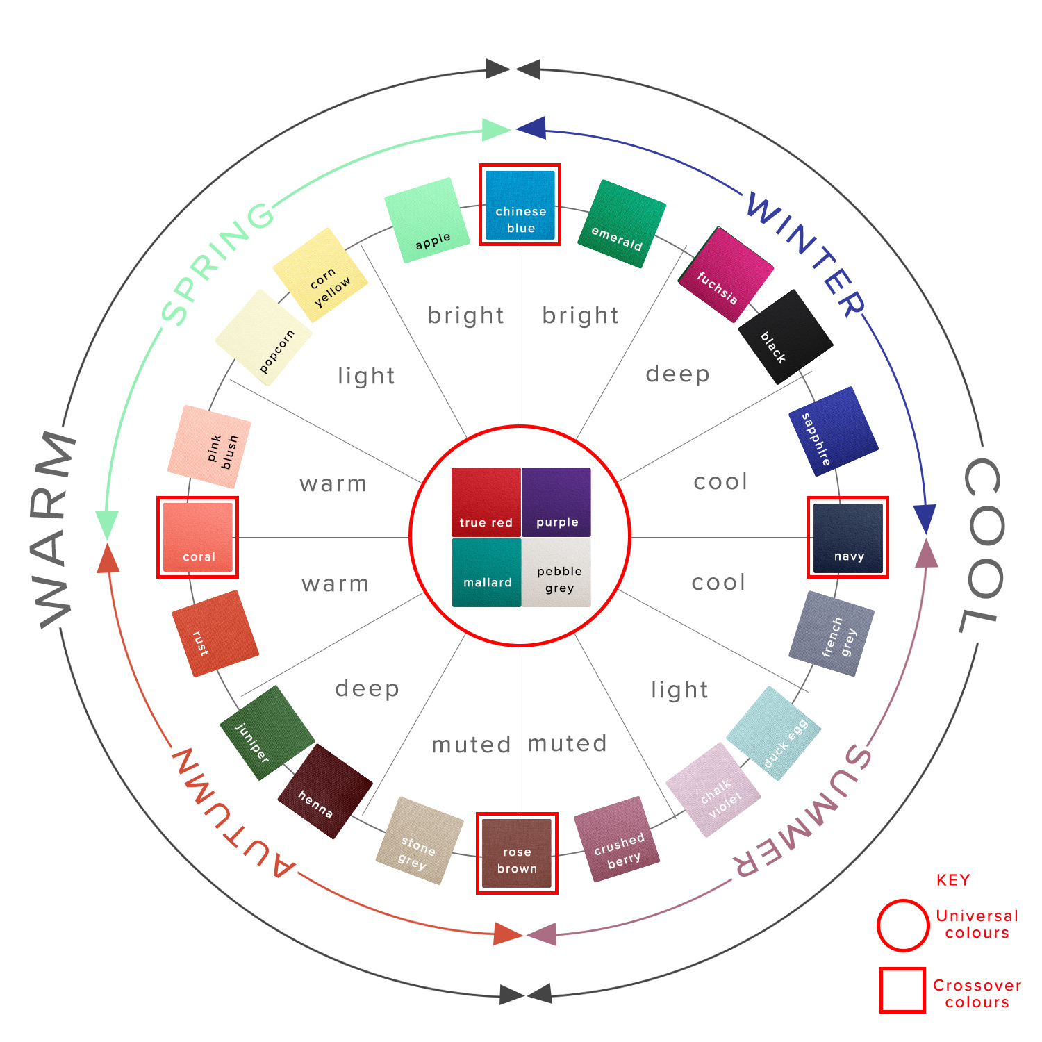
You may have noticed that when we code each of our colours, plenty of colours end up belonging to more than one seasonal palette, denoted by 'sp' for Spring, 'su' for Summer, 'au' for Autumn and 'wi' for Winter in the product listings. If you've had a personal colour analysis, you may well have been told that every single colour belongs to one of the four seasons - it is either cool or warm, and either muted or bright. A colour belongs in your palette, or it doesn't. You may also have had your colours analysed ‘tonally’. Click here for our tonal palettes.
And on a totally technical, science-of-colour-and-light-reflection level, you'd be right. A colour either has more yellow (warmth) or blue (coolness), or it hasn't. However, there are a few factors at play which determine whether a colour can be classified as belonging to more than one seasonal palette.
The specific colour
The first factor to consider is the 'true' colour we are looking at, in terms of how warm or cool it is, how bright or muted it is, and how light or dark it is, and assess which season it belongs to according to that. Colours are divided up between the four seasons in the following ways:
Spring - warm, bright/clear, light to medium, high contrast
Summer - cool, soft/muted, light to medium-dark, tonal/low contrast
Autumn - warm, soft/muted, medium-light through to dark, tonal/low contrast
Winter - cool, bright/clear, very light through to very dark (the only season which contains true white and true black), very high contrast
As you can see, each season shares one or two characteristics with each of the other seasons, which means that a colour that shares those characteristics will fall closer to the dividing line between those seasons. A colour which is warm, medium in depth and falls somewhere between muted and bright, could be a fraction either side of the line between Spring and Autumn.
What affects whether we decide to term it as being firmly on one side of the line, or belonging to both is not a scientific analysis of the chemical make up of the colours and which light waves they reflect but simply our eyes. At Kettlewell it's well trained and experienced eyes, under expensive and often revealing full spectrum lighting. But eyes, nonetheless.
The naked eye
When considering colour out in the real world, we need to accept that we aren't looking at it on a molecular level, assessing the precise brightness and warmth with a scientific measure. We are looking at it with a naked eye.
A person with good colour vision is perfectly capable of seeing the difference between - and the different effects on our skin of - a very warm and a very cool colour, or a very bright and a very muted colour. However, colour is a spectrum, and as we come closer to the boundary line between warm and cool, or muted and bright, it becomes ever trickier for the naked eye to distinguish the difference in the precise colour, and on the fractionally different effect it has on our own skintone. Go one shade or less either side of that dividing line and you've got something which is, on a practical level, impossible to tell apart from the the colour the other side of that dividing line.
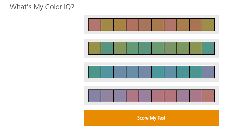
Individual colour perception varies (search online for a colour sensitivity test if you want to see how good yours is!), but even the most perceptive among us have a limit to the differences we can see between very similar colours.
What all that means, in real-life, is that the closer a colour falls to the dividing line between warm and cool, or bright and muted, or light and dark, the less easy it is to put it in one absolute season. So it makes sense to give it to two, three or even four seasons (depending on how close to how many dividing lines it falls).
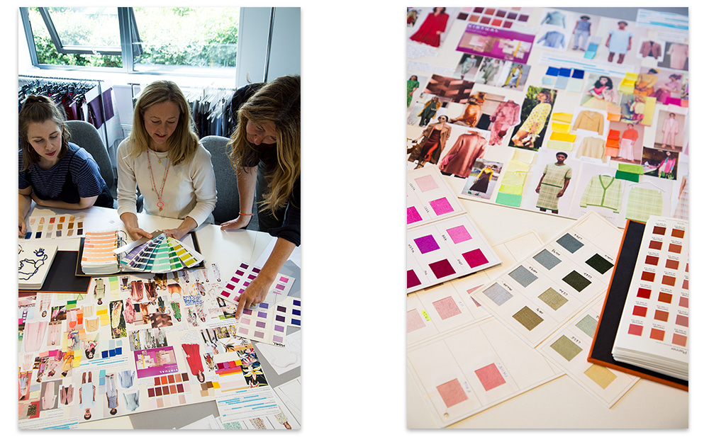
We are introducing Rumba Red next season and it is a good example of the careful process that any new colour goes through before being coded.
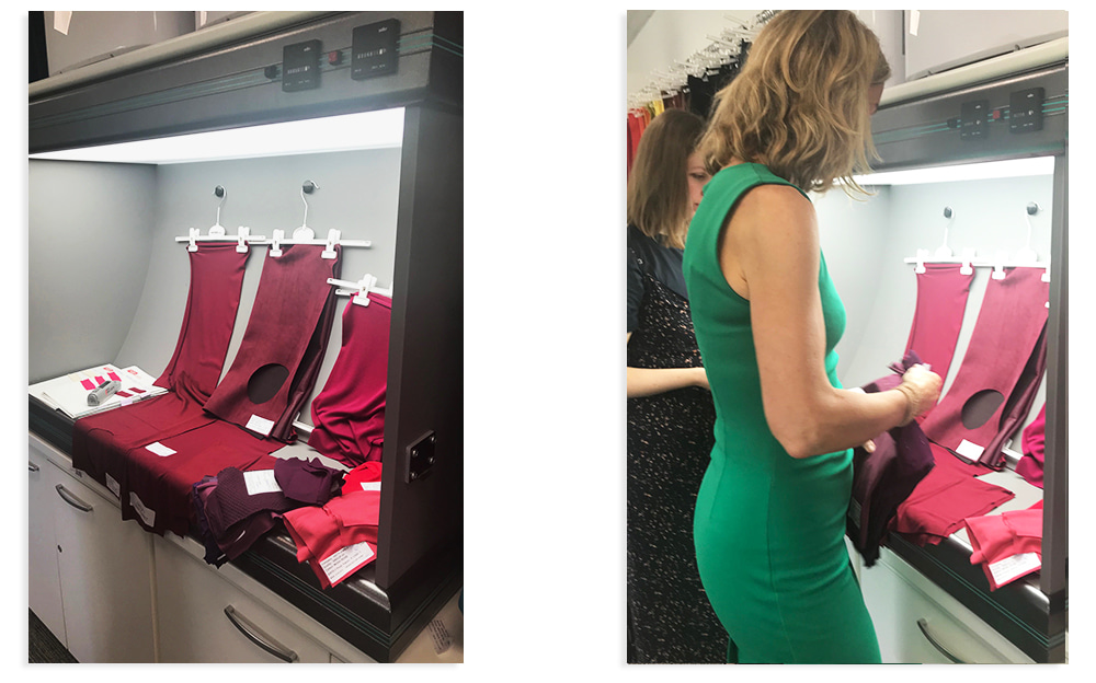
This gorgeous rich, deep red was inspected in our full spectrum light box and tried against swatches of existing colours and a variety of skin tones in the office. When we considered it tonally, Rumba Red sits at the ‘Deep’ end of three seasons; Summer, Autumn and Winter but is not particularly ‘Warm’ or ‘Cool’. As a ‘Deep’ shade it best suits Burnished Winters, Blue Autumns and Deep Summers (for more information on seasonal sub-types read this blog post).
We use colour combinations to 'pull' it further into the relevant season as required. Which leads us neatly on to the third factor when assessing whether a colour can be given to more than one season.
Compare and contrast
It's not simply the reflection of light which affects how we view whether a colour sits within our palette or not - it's also how it appears in relation to the colours next to it. So if we wear a colour in a high contrast way, it looks far brighter than if it is paired with soft muted shades. Likewise, a neutral colour worn with warmer shades looks more like it belongs to the warmer palette, and worn with cooler shades looks like it belongs with the cooler palette.
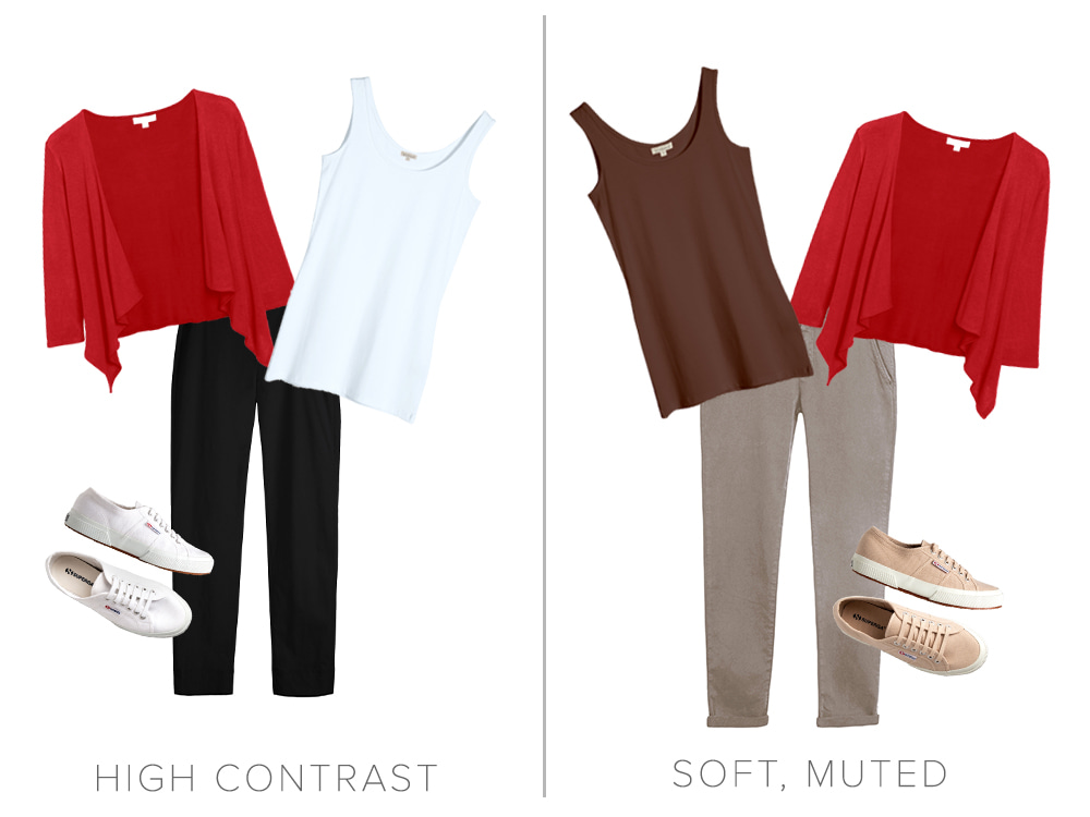
True Red Short Cascade Wrap worn high contrast with White Long Vest and Black Marie Trousers and All White Superga Canvas Trainers or worn with soft, muted Cocoa Long Vest Top, Flint Reiko Chinos and Stone Superga Canvas Trainers.
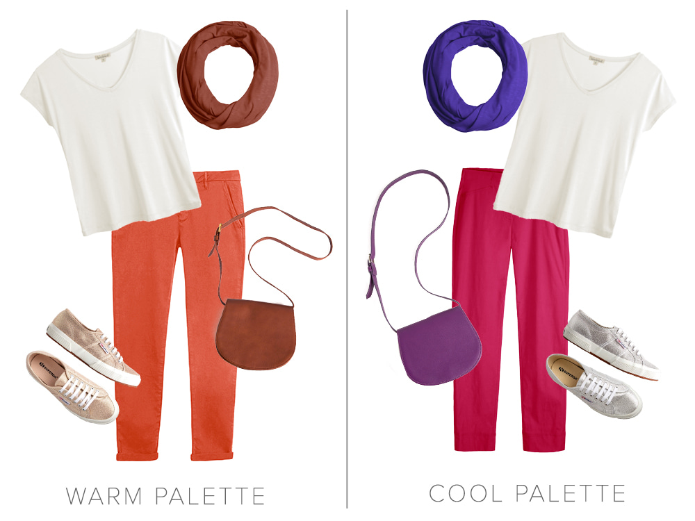
The neutral Nimbus Cara V Neck worn with Copper Rose Florence Infinity Scarf, Burnt Coral Reiko Chinos, Rose Gold Superga Metallic Trainers and a Chocolate Leather Shoulder Bag sits in the warm palette but worn with Lobelia Florence Infinity Scarf, Magenta Rosa 7/8 Trousers and Silver Superga Metallic Trainers and a Purple Leather Shoulder Bag sits in the cool palette.
It is through putting together our outfits, as well as the examination we go through when choosing the individual colours, that we can create a look which is harmonious and flattering for our own unique colouring.
Please remember that Kettlewell’s colour coding is a guide and that your colour consultant can advise you on a more individual basis. We also recommend visiting your consultant for a ‘Colour Re-rate’ every 5-10 years as your star rating within your palette is likely to change as you age. This will also give you some fresh new ideas for updating your wardrobe.

Gill on Aug 04, 2022 11:05 PM
Scored 0 on the test. Had my colours done but came out as ‘bright’ with warm/cool being hard to decipher some years ago. Looking at the outfits definitely bright. Thank you.
Lynda Hudson on Feb 02, 2021 2:10 PM
I also scored 0 and think I am normally pretty good with colours yet I still find it hard to describe my own colour tone. I'm pretty sure I'm Spring but as to the tonal variations I find it very hard to say.
Pru on Feb 01, 2020 8:57 AM
I found it hard to move the little squares, they weren't very cooperative!
Jill Naylor on Aug 02, 2019 4:28 PM
Really interesting and glad to say I scored 0!
Madeline on Jul 15, 2019 7:13 AM
I’m new to on line kettlewell but bought items over the years. Wow what a find with so much colour information love it! Well done I also scored zero on the colour test
Coralie Perry on Jun 13, 2019 7:57 PM
What an interesting piece, thank you! I scored 2 but we can't all be perfect!!
Elaine on Jun 13, 2019 6:04 PM
A test I am happy to score Zero on! Very interesting article - thank you
Susan on Jun 13, 2019 5:25 PM
A question for HQ: If pebble gray, purple and mallard are universal colours, why are there so few designs available in them? Surely they should be as widely available as garments in true red?
Kettlewell Colours: The colours chosen to illustrate the universal colours were generalisations as only one swatch was shown for each. So we would consider Pansy as a universal purple, other Teals such as Bright Teal along with Mallard, and Nimbus and Light Dove Grey along with Pebble Grey. Apologies if this wasn't explained well but it was a difficult colour wheel to construct and still keep it simple! So we do have a wide range of styles in what we class as universal colours when you include these other colours. It's best to check the coding we give a colour on the website.
Hope this helps
Carol Burgess on Jun 13, 2019 11:18 AM
Interesting article on how colours can work for multiple season palettes. I am a sweet pea summer and looking at the blog it gives a limited set of colour which are your best. When I had my colours done primrose was one of my starred colours yet whilst being in the summer colours it is not mentioned for sweet pea. My question is when ordering clothes how can I be sure if I choose something which is also suitable for another or multiple palettes how can I be sure it will suit me and I will not have to return it.
Kettlewell Colours: Hi Carol, we advise not to get too worried if your starred colours don't appear in the summary above - we are all individuals and your starred colours won't necessarily be a perfect match for our summary. If a colour has been starred for you, go for it!
Christine Reed on Jun 12, 2019 1:02 PM
Now I know why my husband and I always disagree about colours. I scored 0. He is clearly the one with a problem!
Moo on Jun 12, 2019 12:17 PM
I just did the colour acuity test online and got 100%! Which is delightful when I consider my Jurassic and shockingly bad eyesight. It goes to show that some people can really see the richness and subtleties of colour (and I guess some can’t but hey ho, we can’t be fabulous at everything). Great article.
Barbara on Jun 08, 2019 6:05 PM
Brilliant and what an interesting colour wheel. I love this sort of blog. I was particularly taken with the section on colour combining. I recently discovered by accident that my Darcey scoop in Bright Teal looks great with a pair of shaded spruce/pine linen trousers. It's not just for neutrals, pale or dark, or jeans.
Helen H on Jun 08, 2019 5:30 PM
Thanks again, Jo, for a wonderfully interesting blog. The test is fascinating and I'll be doing it with my art class! Thanks, too, for the new colour combinations which just get better. Colour is just amazing and your insights help us all.
Olwen on Jun 08, 2019 11:27 AM
Interesting piece!! I enjoyed doing the colour test and thought maybe I had a fairly good sense of tone because I am pedantic when I don't feel that shades work .... However, I didn't expect to score a "0" ! I learnt one useful thing which I will try out .... Buy a crossover colour and put it with my Cool Summer :)
Susan on Jun 08, 2019 11:05 AM
Very interesting blog post. I did the colour sensitivity test and scored a perfect 0.
Jane Bennett on Jun 08, 2019 9:50 AM
As always your latest blog really interesting . Keep up the good work !!