

The Basics Of Colour Blocking

Colour blocking sounds somewhat intimidating, a 'fashion' term that only those in the know can get right. The reality is far simpler; as long as you stick to colours from your seasonal palette, colour blocking is fairly foolproof, and a simple way to combine colours - both bold and less intimidating ones - within an outfit.
The biggest concern people have with colour blocking is straying from 'chic, confident, stylish' into 'children's TV presenter'. But by sticking to a few simple guidelines, you can wear your colours with confidence, knowing that not only do they flatter you but that the combination looks incredible.
Firstly, get to know and love your personal colour palette, and use it to its full effect here. If you don't know your seasonal palette, our colour quiz can help you uncover it, and you can ensure that no matter how daring your colour blocking, the shades next to your face will flatter your skintone and make you look and feel your best.
Secondly, don't try to go from zero to rainbow in one move. Colour blocking doesn't need to be pink and orange and green and purple all in one outfit. Starting with just a couple of colours, whether they are analogous, complementary or tonal (more on this in a moment), can be a much less intimidating way to experiment with colour blocking without needing to wear every colour in your wardrobe at the same time. Which isn't to say that once you've got your confidence up that you can't begin to play with two or three or more wildly clashing colours within your outfit!
Finally, avoid prints. If you're someone who likes the camouflage or extra detail that a print provides, this can be a tricky one, but even fairly subtle prints, really completely detract from the joy and boldness of colour blocking. Keeping the cut of your clothing flattering but simple and letting the colours speak for themselves is the most effective way to carry off colour blocking with confidence.
So you've got your palette, you're feeling brave, and now you want to give colour blocking a go. Which colours should you choose within your palette? Our three simple steps to colour blocking will lead you through from the simplest and most classic version through to bold, bright and beautiful, without frightening you away from your brights for life!
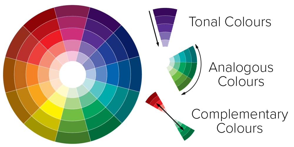
Tonal Colours
Opting for tonal colours is the simplest way to experiment with colour blocking. Even within the brighter seasonal palettes - Spring and Winter - opting for different versions of the same colour can look sophisticated while still carrying that colour blocking pop
Analogous Colours
If you're ready to get a little bolder, then looking at analogous colours - ones that sit next door to each other on the colour wheel - is a great step up from tonal colours. Use your versions of combinations such as green and aqua, orange and yellow, and red and purple. Add in a third analogous colour for even more interest - more than that can be rather tricky though
Complimentary Colours
The ultimate in 'clashing but matching', complementary colours sit opposite each other on the colour wheel and create a bold, high impact colour blocking look while still sitting comfortably together. With versions of every colour within every palette, it should be possible to find a complementary combination for your seasonal palette.
How do I translate this to my seasonal palette?
The same guidelines apply to each of the seasonal palettes - just choose 'your' version of each of the shades shown for a similar look which flatters you and your natural colouring.

About Kettlewell
Kettlewell | The Colour Experts
We’re here to help you fall in love with your wardrobe. We combine colour expertise with elevated essentials, to help you fill your wardrobe with exceptional clothes in colours that work for you. Founded in 2004, we are a British womenswear brand created to help women unlock the secret to effortless dressing. As a team of colour experts, we’re passionate about colour, style, and helping you build a wardrobe that works.

