Perfect prints for Springs
As a Spring, prints can feel a bit tricky - do you go bold and wear All The Colours? Or do you keep it sophisticated and risk losing your Spring brightness in a muddle of shades? The solution is a little of both. Make sure your print has brightness and contrast, and don't go for too many colours in one print for maximum impact, but if you want to keep it sophisticated, go for coloured prints on a neutral navy, cream or grey background.
Kettlewell's prints, of course, are all carefully selected to work for your seasonal palette, so there's no need to worry about hitting the right proportion of your colours in a print as those lovely folk spend literally hours poring over prints to make sure they work perfectly for the seasons they are allocated to.
And once you've found your perfect print, what on earth do you pair it with? Just follow one of our simple formulas for wearing print. Start with a basic stripe and work your way up!
The stripe is right

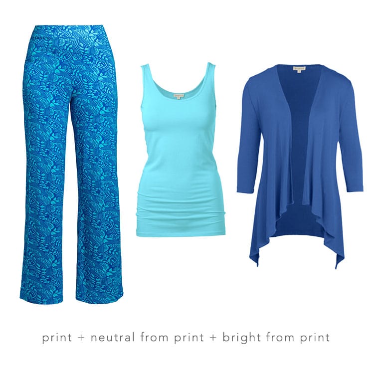
Keep it co-ordinated
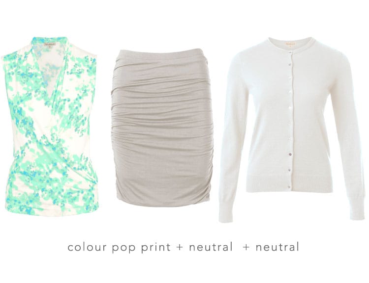
Neutral with a pop
Go for the clash
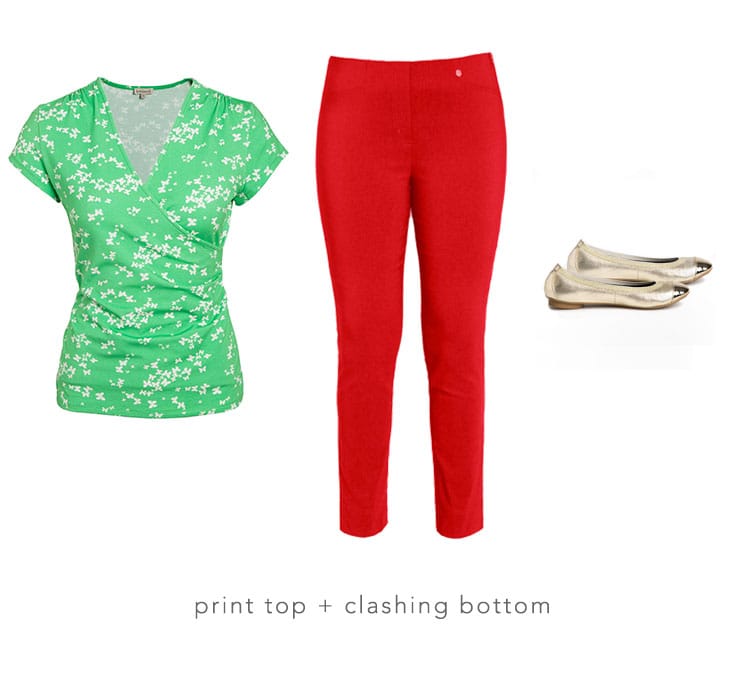
Butterfly faux wrap in Apple/Soft White, Rosa 7/8 trousers in Poppy
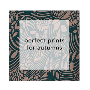
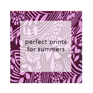
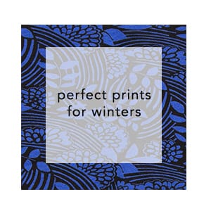
To see perfect prints for other seasons, click the link below: