Colour conversation with Jane Monnington-Boddy
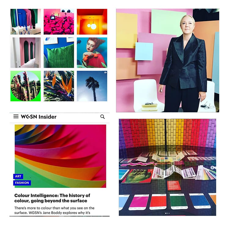
Jane Monnington Boddy, Director of Colour at the trend forecaster WGSN, shares her insights on colour – from its effects on our emotions to the big new tone for 2020…
Can you tell us about WGSN and your role as Director of Colour?
I was originally a fashion designer but moved over to trend forecasting back in 2008. My role at WGSN involves a lot of research, which means travelling globally as well as making the most of London, which remains a huge source of information. It also involves brainstorming with the global teams.
Public speaking is a key part of my role. I’ve spoken at fashion and design events in the past few years, in Dubai, Moscow, NYC and Sao Paulo. I also work a lot as a consultant, which can lead me to work with some of the world’s leading tech, design, interior and fashion companies.
How you go about composing a colour forecast? What influences the trends?
My role as colour director at WGSN is to study patterns and shifts and developments in many areas from art, fashion and design through to science, tech and economics. There are no rules when it comes to sources of information. At the moment I’m looking at what sustainability means in terms of colour.
What big colour are you predicting for 2020?
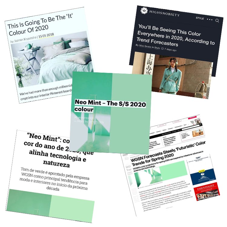
We see the clean pure tone Neo-Mint as a colour that will grow in popularity in 2020.
It’s a fresh oxygenating tone that connects tech and science with Nature and plant life.
This aligns with developments in the new super algae as a viable solution feeding the growing population and as a fuel substitute.
From a fashion perspective Neo-Mint embodies the drive-in trends towards tone that have gender neutral appeal, which by 2020 will have moved on from the more feminine hues in this area.
On a personal level, how does colour make you feel?
Incredible. I’m gaining a deeper understanding of how colour affects us on an emotional level and have a real focus in my research on what this means to the modern world in terms of design.
How much has colour made its way into your wardrobe and home?
Everywhere, in particular in my home. I have a lot of blue and green in the living areas with bright accents. And then the bedrooms are soft and calm in colour choices.
Last great colourful fashion buy?
A neon-orange Issey Miyake Pleats Please vintage skirt.
Have you ever had your colours analysed?
No I would never want any part of me analysed!
And finally, do you have a favourite colour?
Bright sky blue – it’s a colour that makes me think of sunny days.
Jane is on Instagram @janes_addictions
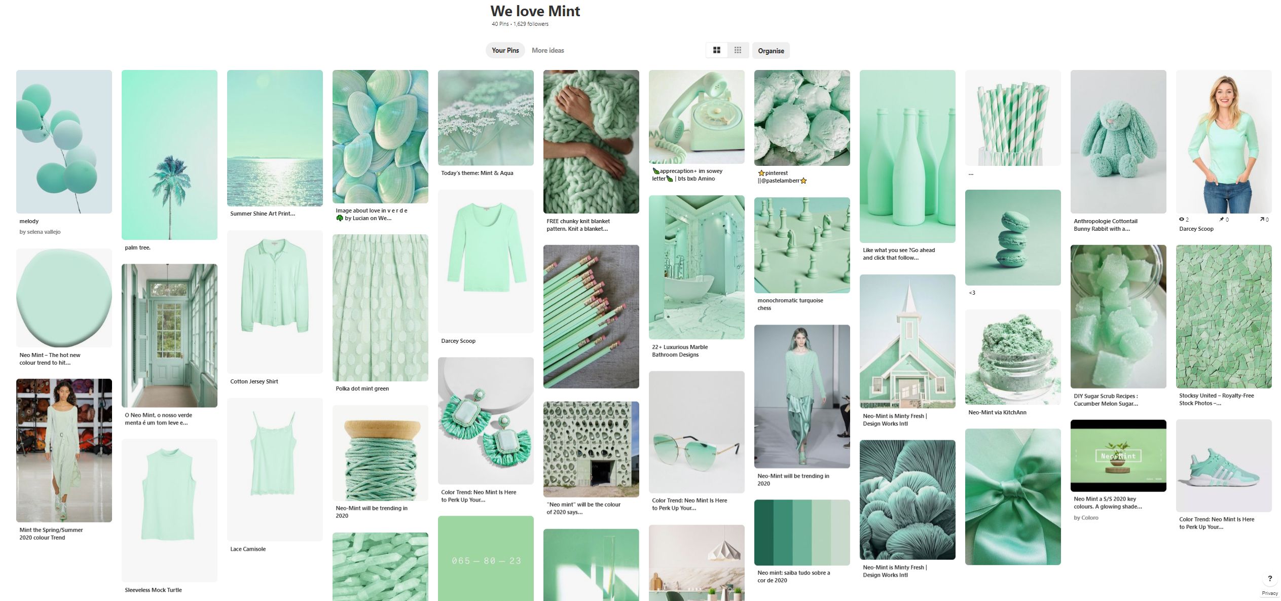
Why not check out the Kettlewell 'We love Mint' Pinterest board?


Virginia Quant on Feb 15, 2020 8:48 AM
You recommend white on top or bottom half, another colour on top. If one is an apple shape , and average height, doesn't this just chop one in half? Thanks
Eileen Mitchell on Apr 14, 2019 11:28 AM
Jane - you are telling us about colour yet your picture shows you wearing Black - which does not ‘do anything’ for you! Not a good advert for what you are putting forward.
Joyce Ricketts on Apr 13, 2019 4:50 PM
No one does colour like Kettlewell. Im a colour girl, winter 67yrs size 8, with silver blond hair and I know I can always go to your site for something bright that feels good to wear. Recently bought Joanna dress in dutch blue. Another excellent reliable outfit for my wardrobe. I dont follow trends rather what I like and colours that make me happy. Thanks
Elaine McBane on Apr 13, 2019 4:43 PM
Is there an video on someone doing colours on a Bright Spring Person.....
Bright Spring is hard to find in Colours (Grey Hair)
Liz williams on Apr 13, 2019 9:34 AM
Have been told i’m A winter colour person any advise would be appreciated for colours to wear in the spring and summer many thanks liz