Colour conversation with designer, Jackie Piper
In the latest of a series of Colour Conversations with people we admire from the world of colour, Melissa talks to Jackie Piper, one half of a dynamic design duo that is Designed in Colour, which produces an award-winning selection of vibrant design-led homewares.
What inspired you to launch Designed in Colour?
We have always been colour geeks (a lot of designers are!). Victoria and I both spent many years designing and developing colourful product collections for other brands, including a huge range for PANTONE, the global colour system used by professionals. Having been involved in all these wonderful creative licenses for years, we hankered after a brand of our own and so set up Designed in Colour as a focal point for our own colourful home collections. In 2015 we launched, and here we are today.


You recently introduced a collection of British Colour Standard mugs, inspired by the historical 1930’s colour matching system. Can you tell us about it?
This has been a work in progress for about two years. We knew the historic colour system existed from our respective design training and spent many hours scouring the old colour books, thinking how lovely it was.
The light-bulb moment was that maybe we should be the ones to bring this back for the 21st century. We then set about digitising the old colour swatches made originally of wool and silk ribbon with a high-tech colour scanner, so that the colours could be reproduced accurately on products today; like on our lovely bone china British Colour Standard mugs.

From rose-coloured tumblers and cobalt blue wine glasses to tangerine orange place mats, every product is a colourful gem. Do you have a personal favourite?
I do! I love our hand-blown coloured glassware. It is durable (a must with my family), dishwasher safe (another must). I have a long shelf across our kitchen window where keep them all in various tones, which creates a dazzling stained-glass-window effect in the kitchen on a sunny day.

How much of a role does British heritage and nostalgia play in your brand?
The heritage of the system and being true to the original system colours and all the incredible work done in the 1930’s is very important. Matching azaleas and beetroots – with incredible accuracy, I might add, as I cross-checked a great many with a digital scanner – was amazing given the technology used at the time.
There is nostalgia there, by definition. They cared so much to match the specific collection of colours for bunting, for example, not just in the UK but around the then British Empire. They matched colours such as Post Office Box Red and Battleship Grey, a part of our national consciousness, and even squirrels and pigeons. The mind boggles! We are happy to be true to the original and also to add more to the system. Watch this space.

What do you think it is about colour that captivates and excites people?
Everyone has a favourite colour – one they love, another they hate.Who is not united or divided by that avocado green of 1970’s bathrooms, or a particular car colour, like British racing green perhaps, or the colour of a beloved piece of clothing? It is a part of our lives from the moment we are born. Colour surrounds us and informs our world; it is a part of food, drink, clothing, an inescapable force around us. We cannot help but be captivated (but perhaps some of us get more excited about colour than others!).

What do you think it is the next big thing in the world of colour?
Ooh, the next big thing. Well, I still think the greys will continue to be a big part of home décor; it works so well in so many periods of home, and as many have found is not drab or dull but cool and calming and a great neutral backdrop for the rest of your worldly goods, which can then be in stronger, brighter tones.
To move it on a step, I think adding a dash of metallic in amongst this – a silver feature wall, for example, in a bathroom or bedroom that picks up and reflects light at different times of the day – can really transform a space. Coppers and brass effects in tiles or paints in key locations, like a splashback in the kitchen, can be really timeless, as well as on trend, and they all work well with the neutral greys.
Does your own home reflect your love of colour?
My own home is mostly chalky whites, greys and natural wood. There’s an unpainted door from 1930, all flaky and crumbled, which we have left. I don’t want to change its story.
How colourful is your wardrobe, and what shades do you gravitate towards?
OK, well here is where everyone can roll their eyes. I am a typical designer in that most of my wardrobe is black and shades of, with a few white and navy shirts and a bit of washed out denim (sorry!). With my clothing I have to admit I am far more boring than with the colourful products we design.

Have you ever had your colours analysed, and if so what season are you?
I have not and I now want to do this immediately! As a red head I always felt a natural affinity with autumn. I love all the colours that are a natural part of that season. I have always felt like I blended in better with golden autumn leaves and smoky tones than say the colours of spring. I also love autumn dressing; woolly jumpers, cosy wraps and boots. That has to be my season.
Last great colourful buy?
I am not sure if a pet counts but I bought the most amazing ginger fluffy Silkie bantam chicken for my birthday. It was only afterwards that my family pointed out that it matched my hair and I had basically bought myself, but in chicken form. I really didn’t see it at that time!
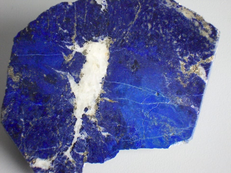
And finally, if you had to pinpoint a favourite colour, what would it be?
These questions are hard! I will always love Lapis Lazuli blue; a powdered version of a colour the artist Yves Klein used a great deal. It is almost electrically dazzling if you see it in its pure form, and is a natural mineral that occurs as that colour. Incredible. Imagine finding a chunk of that a few centuries ago! We have a small piece of it which we brought in a market in Morocco – it is like having a bit of magic in a pot. Every now and again we find it and just look at it for a few seconds. It is stunning stuff, and literally colour in its purest form.