Seasonal and Tonal Colour Palettes - Making Sense of it All

blog templates (30).png

Last week, Melissa and I took ourselves off to Hampshire to meet top colour analyst Nicola Davis. Nicola is trained under Colour Me Beautiful's Tonal Directions system, and is one of the most successful consultants using this system.

Longstanding Kettlewell fans will have seen comparisons of the tonal and seasonal systems before (you can read one I wrote recently here), and we have been researching the perfect way of using both systems together to help find your best colours.

Now that we've met with the brilliant Nicola, we understand both systems fully and can help you understand, shop and wear your best colours with even more confidence, regardless of whether and how you've been analysed.

Understanding where you sit on the colour wheel from both a seasonal and tonal perspective, rather than simply the phrase 'I'm a Spring' or 'I'm a Clear, Warm and Light' in isolation, will help you discover even more colours that you can wear, and how you should be combining them to create outfits that wow! And if you've never had a formal colour analysis, read on for how this information will help simplify things for you.

What is tonal analysis?

If you've been analysed under a seasonal system, you might not have come across tonal colour analysis. Without getting too in depth, tonal analysis doesn't describe your colour palette simply as a season, but instead describes its dominant, secondary and tertiary traits (dominant is always listed first, secondary and tertiary are interchangeable and can be listed in either order after the dominant).

The six tonal direction designations are Warm, Cool, Deep, Light, Clear, Soft, so you might, for instance, be classified as Warm, Light, Clear, or Cool, Deep, Soft. While they don't always relate precisely to specific seasonal palettes and seasonal sub-types (the narrower palettes of 'wow' colours within each season, such as the Blue Spring colours or the Soft Summer colours), a translation is possible. And that's where we really feel the magic happens - adding the knowledge of your dominant tonal direction to your seasonal palette is the key which will unlock your best colours, and the best way to combine them. Even if you don't know your seasonal sub-type, we're going to be discussing how to start to consider your dominant tonal direction in the coming weeks and months.

raw-chart_c.jpg

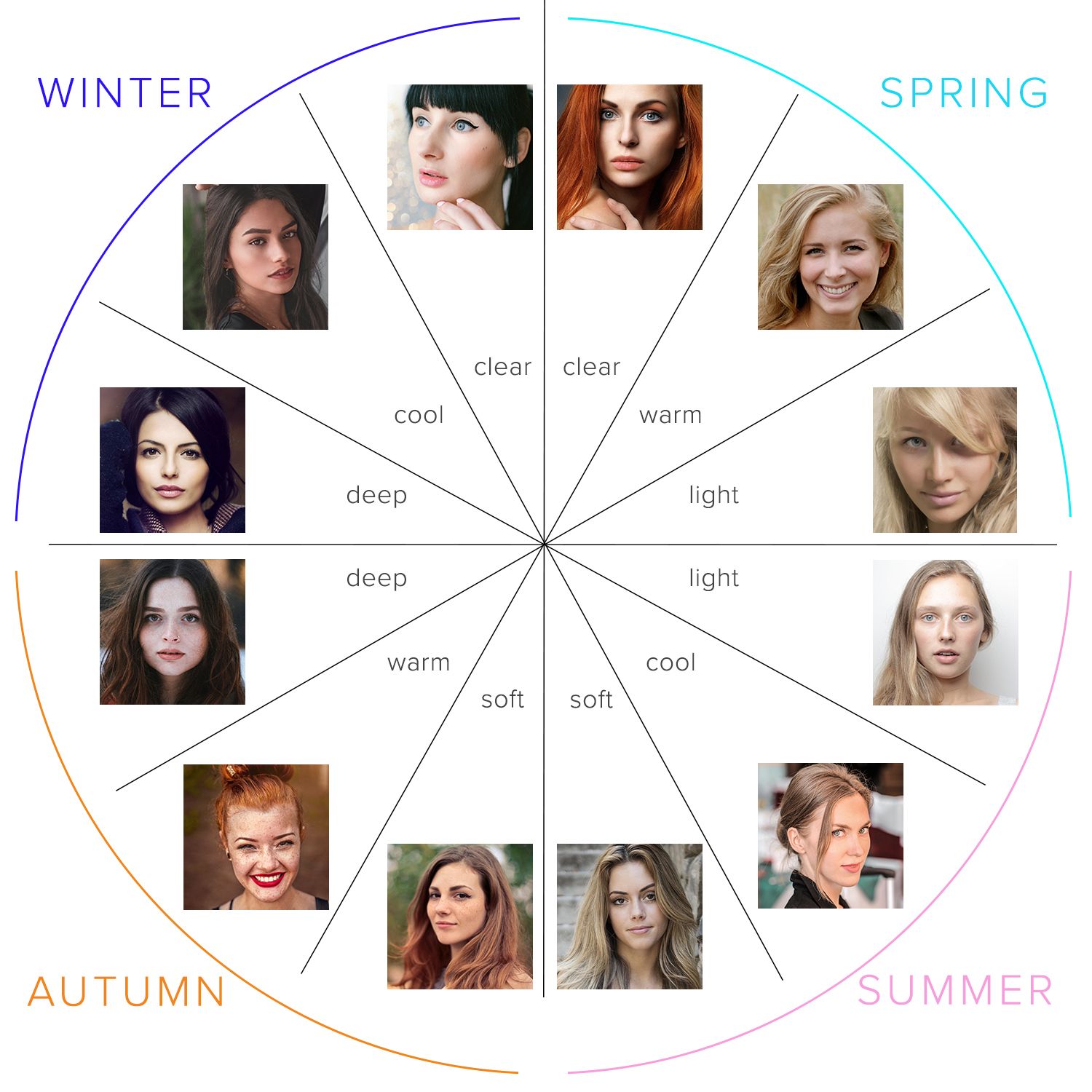
Adding tonal directions to your season

Firstly, don't panic! We'll still be using the four main seasonal palette designations every single time we describe a colour. This means that each and every colour will continue to be coded as either Spring, Summer, Autumn or Winter.

However, we want you to also understand where you sit tonally, in order to fully understand your own personal palette, including those colours which might work for your particular seasonal sub-type but might not work for everyone who shares your season.

As such, we've created a translation guide for you, to help you understand how your seasonal sub-type relates to your dominant tonal direction.

For each of the tonal directions groupings below, I've created a 'translation' into the appropriate seasonal sub-type, so you can see which dominant tonal direction applies to you.

raw-pinks.jpg

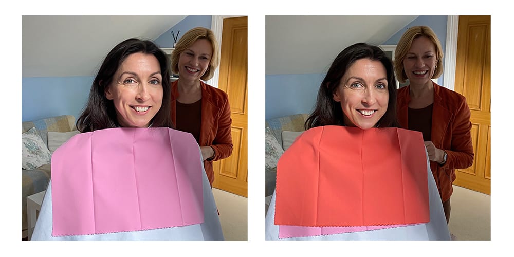
The soft cool pink on the left makes Jo look chalky and washed out, whereas the warm coral pink gives her a healthy warm glow.

Cool

Your dominant colouring is cool with no warmth to it. To achieve harmony and balance, you need to wear colours which have blue or cool undertones and which can be from a light to deep tone. Avoid yellow and golden based colours entirely. You might opt for a more tonal look, or some contrast, but high contrast can be overwhelming for you.

Cool, Soft, Deep = Brown Summer

Cool, Soft, Light = Sweetpea/True Summer

Cool, Light, Clear = Bright Summer, Sprinter Winter

Cool, Deep, Clear = Sultry Winter

raw-cool.jpg

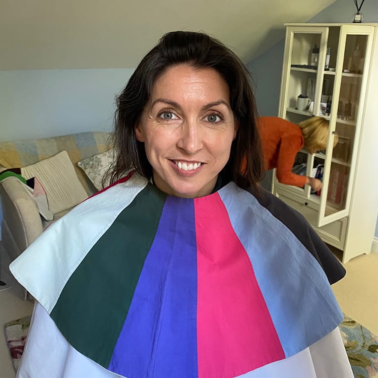
Jo experienced the client journey under the tonal directions system. These Cool colours are too stark and icy for Jo's skintone, making it look pale and washed out.
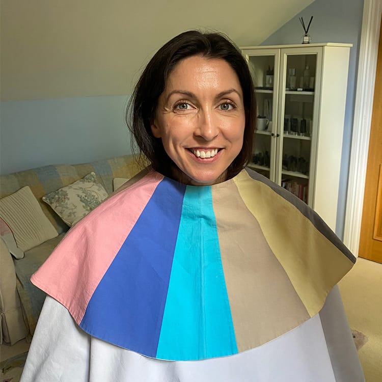

Warm

Your dominant colouring is warm and golden. To achieve harmony and balance, you need to wear shades that have a yellow or golden undertone, and avoid all cool tones. Your best colours can be from light to moderate depth. Warm up your navy and greys with, for instance, yellows and corals.

Warm, Clear, Light = Golden/Warm/True Spring

Warm, Clear, Deep = Vibrant Autumn

Warm, Soft, Deep = Leaf/True Autumn

Warm, Soft, Light = Soft Autumn, Light/Pastel Spring

raw-warm.jpg

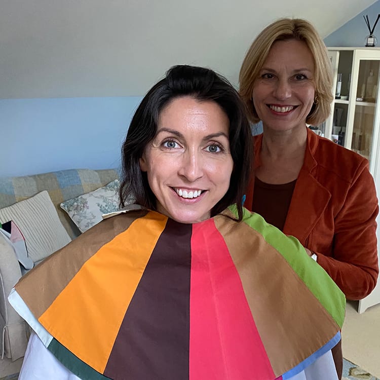
The Warm colours are much better on Jo, giving her a more even and glowing complexion.


Light

Your dominant colouring is light and delicate. To achieve harmony and balance, you need to use light to medium depth colours. Do not overpower your natural colouring with dark combinations and when you wear the darker colours of your palette, keep the lighter shades near your face.

Light, Warm, Clear = Pastel Spring

Light, Warm, Soft = Pastel/Light Spring, Soft/Light Blue Autumn

Light, Cool, Soft = Pastel/Light Summer

Light, Cool, Clear = Sprinter Winter, Bright Summer

raw-light.jpg

The Light palette doesn't have nearly enough depth for Jo, and we lose the brightness and contrast in her skin and eyes.


Deep

Your dominant colouring is deep and intense. To achieve harmony and balance, you need to wear somewhat darker colours together, tonally or in contrast. Avoid wearing pastel shades on their own.

Deep, Warm, Clear = Deep/Dark/Blue Autumn (suits more contrast) - this is me!

Deep, Warm, Soft = Deep/Dark/Blue Autumn (suits more tonal)

Deep, Cool, Clear = Deep/Dark/Burnished Winter

Deep, Cool, Soft = Deep/Dark Summer 

raw-deep.jpg

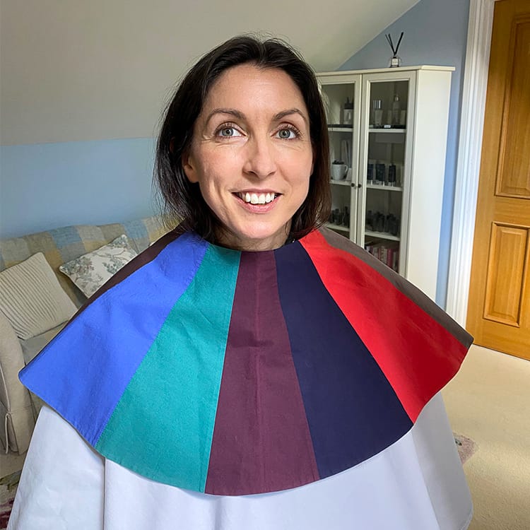
Deep is where the magic happens for Jo - her skin is even and smooth, her eye colour intense, and her hair feels natural and in harmony.
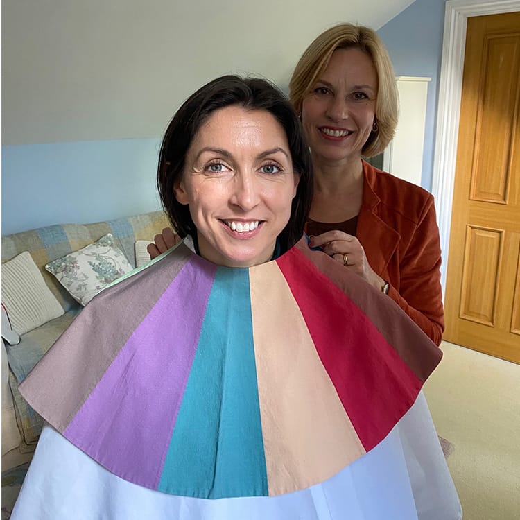

Clear

Your dominant look is clear and contrasting. To achieve harmony and balance, you need to wear colours of contrasting depths, or neutrals with brights. Avoid blended or a tone-on-tone look (i.e. two light or two dark colours together).

Clear, Warm, Light = Bright/Blue Spring

Clear, Warm, Deep = Paintbox Spring/Vibrant Autumn

Clear/Cool, Light = Bright/Sprinter Winter

Clear, Cool, Deep = Jewel Winter 

raw-clear.jpg

Clear colours worked quite well, giving Jo's eyes clarity, but weren't as good as the Deep shades.
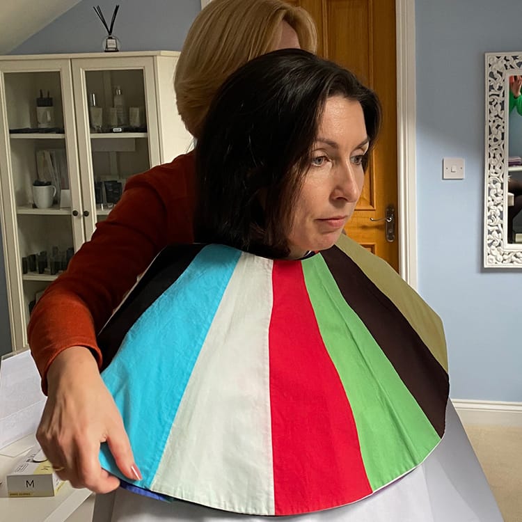

Soft

Your dominant look is soft and muted. To achieve harmony and balance, you can wear tone-on-tone shades from the same colour group. Darker colours from your palette can be worn with shades that are one or two tones lighter. Use contrast with care and avoid vibrant colours.

Soft, Warm, Light = Soft/Light Blue Autumn, Pastel/Light Spring

Soft, Warm, Deep = Leaf/True Autumn

Soft, Cool, Light = Sweetpea/True Summer

Soft, Cool, Deep = Soft/Brown Summer

raw-soft.jpg

We all agreed that soft was the worst palette for Jo! She looks chalky and boring.


This more universal language will help set the scene when we're talking about seasonal palettes and sub-types/specific colour combinations within those seasonal palettes.

How does this help me if I've been analysed seasonally?

They joy of combining your season with your dominant tonal direction is that it gives you more of your best colours than simply looking at your seasonal palette.

For instance, if you're a Burnished/Deep Winter, there will be lots of Deep colours which will work for you but that we can't in good conscience code as a definite 'Winter' colour. So knowing your tonal direction means that you can browse both 'Winter' and 'Deep' colours to find colours you love, and which will work for your unique skintone and colouring, rather than simply looking at the colours which will suit all Winters but don't take into account where you sit within the Winter palette.

We're going to be talking a lot more about these crossover/tonal direction colours and palettes in the coming months and really helping you get to grips with using your dominant tonal direction to support your seasonal analysis.

How does this help me if I've been analysed tonally?

The same, but in reverse! If you've been analysed as Cool, Soft and Light, for instance, you've probably browsed the dominant 'Cool' palette, perhaps Soft and Light too, but possibly found too many colours or been unsure how they will pair together. Using the season related to your palette as well (in this case, Summer) will give you a sense of how to put your colours together, and help you search for inspiration on our seasonally coded website.

How does this help me if I've NEVER been analysed, or I don't know my seasonal sub-type?

This is where our real love of tonal directions comes in - if you've never been analysed, it can be an awful lot easier to figure out your dominant tonal direction than it is to figure out your seasonal palette. We're going to be talking more about this in the coming weeks, but for now, take a look in the mirror. What's the first thing you see? Dark eyes, tanned skin and dark hair? You're probably a Deep. Mid tone 'is it blonde, is it brown?' hair, soft eye colour and medium skin? You might well be a Soft.

Don't panic if you can't see this quite yet - we promise more tips and tricks in the future! Our seasonal palette quiz should be enough to get you started for now.

Now you can head to Shop by Colour in the navigation bar to find YOUR colours - enjoy!

Linda on Jun 15, 2023 2:33 AM

Hello! I was analyzed to be a Cool Clear Light. According to your article it seems to mean that I am bright summer / sprinter winter, is that correct?

Carman on May 04, 2023 5:09 AM

I think you guys have nailed it with these palettes! Where can I purchase one or two of these summer palette fans to try out?

Janet Jones on Mar 20, 2023 10:04 PM

This is brilliant. After being analysed as a Dark Summer. I knew my wow colours were the darker colours within the summer palette. However, I was confused by how this translated into the Tonal System, especially the Dominant, Secondary, etc. Thank you Kettlewell you have explained it perfectly. Deep Cool and Soft. Deep being the dominant for Dark Summers'. I assumed that Soft would be the dominant, but that is fora Brown Summer; and I really don't suit browns of any kind. Putting Summer and then Dark in the filters when you search by colour; then gives me my ideal colours. 🥰👍

Rimsha on Mar 20, 2023 2:04 AM

Well i think im dark winter.. but when i see this post about dark/Deep summer actually is fit on me.. i can wear all dark winter except white and black.. that not my favorite outfit.. that make sense that im deep summer.. my eyes is dark brown but have a hint of ashy tones.. like my eyes is between dark charcoal mix dark taupe color..

Alison Denton on May 26, 2022 8:49 PM

Thanks for your helpful article. Please include a photo of African heritage on the wheel.

Jayne McClelland on Dec 15, 2021 9:05 AM

So I was browsing this page after watching Melissa's warm tutorial. My husband looks over my shoulder and spots Jo's best shades immediately! He is so good at colour. Just as well as I can ask him as I struggle with it. This post really helps. It helps limit my choices so I don't wander into alien territory. I do so love colour. Great post a year after and going forward no doubt too.

Stella on Sep 09, 2021 5:57 AM

Tonal considerations make such sense. I think many people are between worlds colour wise. I was analysed by CMB 30 years ago as a Summer but felt the colours too flat. I preferred Spring as I need colour to come alive. Soft and light definitely. This is enlightening. Thank you Kettlewell.

Petra Willnecker on Jun 24, 2021 1:01 PM

A big thank you to Kettlewell Colours! Thank you for all the wonderful colours you offer, and thank you for taking the time to write so many great posts!

I was analyzed as Dark Autumn many years ago, and I have loved my palette ever since. Recently, however, I've been unsure. As I‘m getting older, some colours and colour combinations no longer look good on me. I‘m a bit lighter and softer than the typical Dark Autumn, yet by no means a different sub-season or even season.

Then I tried some lighter colours - musk rose, heliotrope, and peacock, and I'm happy with them. An infinity scarf in "lemonade" brings a bit of spring sunshine to my dark autumn clothes.

The name „Blue Autumn“ for this sub-season instead of just „Dark Autumn“ has opened my eyes and encouraged me to look at new colours beyond the dark palette. So I found oxford blue, one of my favourite colours. And this very informative post explains that the Blue Autumn comes in several "versions", and that there is a Light/Soft Blue Autumn, too! Thank you, I‘m back home in my sub-season, loving and enjoying my colours, and looking forward to discovering more.

Lorraine venters on Jun 19, 2021 5:35 AM

Wondering if you are going to produce more colours in the Chloe Jacket. I’ve bought lavender, I’m a sweet pea summer

Terri L Freeman on May 29, 2021 4:21 PM

I'm excited to discover Kettlewell and I love the colors. I've always considered myself a winter and I gravitate to those deep, rich colors. However, I'm also nearly 5'11' tall, so I'm lucky to find clothes long enough period, let alone care about whether they're perfect for my color palette. Sure wish you (and most companies) carried tall sizes. The petites are well cared for, but we tall ladies are lucky to find clothes period. Bravo for your beautiful colors, though. I'll be able to buy a few of your things.

Lyn on Apr 30, 2021 9:26 PM

Ive had my colours done twice over the years, first time a Spring, which I never felt completely comfortable with! Second time a Summer...with your circular diagram now I see why I might be more tricky as I’m likely on the cusp between the two.

Marguerite Woodall on Apr 24, 2021 6:45 PM

Great article. I'm currently learning to be a color analyst and wish that CMB in the US was as sophisticated as in the UK, or like it was in the 90's. I've been tonally analyzed as "cool" and told by more that one analyst that I'm a "winter", but I like some of the summer colors. I have trouble with dark colors near my face. Think I'm either a Sprinter Winter or Bright Summer. Would love to really know instead of just guessing.

Pamela Margaret Kay on Mar 18, 2021 11:18 AM

Such an interesting concept. I did the colour quiz and the answer was summer -cool. I did CMB about30 years ago and I was told winter.

Your range of colours are beautiful but do I go Summer or Winter or some from each as they are similar? I'm pale skinned, dark brown hair but going grey, I'm 73.

Thank you.

Sue on Feb 07, 2021 3:30 PM

Oh dear!! This explains why I, as a Spring identified some 50 years ago by CMB, often stray into Winter's "shocking pink" or some summer shades but I am totally confused. Cannot follow clear/soft/deep etc. Will study as you follow this up. My wardrober has been curated to CMB since the early 70s

hazel Robertson on Dec 30, 2020 10:36 AM

As a colour consultant of many years I found myself learning a lot by comparing the two systems. Thanks for this really informative post!

hazel Robertson on Dec 30, 2020 10:35 AM

Even as a colour consultant of many years I found myself learning a lot by comparing the two systems. Thanks for this informative post

julie on Nov 29, 2020 8:38 PM

thank you for including the photos showing a range of colours for each tone. I have only been analysed by season but seeing the groups of colours together made it easy to see which would work best for me, and brilliant to then be able to search for those colours on the website.

Barbara on Nov 06, 2020 2:57 PM

Very interesting and I look forward to the next instalment. I like my Autumn palette and know the areas in it that suit me best. If I look at the Warm palette there are Spring colours there too. Will I just have to learn how to filter them out with experience and your help? However I can see that the two systems support each other.

Linda on Nov 02, 2020 3:36 PM

I’m a soft and it would be wonderful if you could do some colour inspirations from a tonal perspective? Fingers crossed!

Eileen O'Boyle on Oct 30, 2020 11:38 AM

This is so helpful and interesting. And yes, I will be looking under the 'clear' banner because as a Paintbox Spring, there are colours there that I love, that are not characterized as Spring. Thank you soo much.

Susan on Oct 28, 2020 2:05 AM

Thank you Jo that was extremely interesting and has thrown a pleasing light on an area I was hitherto in the dark about!

It makes so much sense when seen like this on the colour wheel!👍🙏

If you find with this that you are sitting next to a different temperature but similar colour intensities does that give you the crossover colours?

Thank you so much!👍🙏🙏🙏👏

Kettlewell Colours: This blog post goes into more detail about cross over colours and relates to seasonal and tonal palettes. https://www.kettlewellcolours.co.uk/blog/jo/how-can-colours-work-for-multiple-seasonal-palettes

Another colour wheel for your enjoyment!

Mary on Oct 27, 2020 9:33 AM

Thank you so much for this blog and enormous thanks to Maxie Absell for her comment, whose description of herself is exactly me! I’ve been a big fan of colour analysis for 30 years, seen others do well with it but never felt I’ve got it spot on for me. This tells me me why and where I’ve been going wrong. Thank you! Keep the blogs coming please Kettlewell.

helen foley on Oct 26, 2020 8:43 AM

Great detail , thank you.

I'm Autumn and warm but I'm going grey, which I'm happy with .

Does this mean my colours will change?

Many thanks

Helen Foley

Una Daniel on Oct 25, 2020 3:03 PM

I love this article.

Having my colours done over 20 years ago is the best thing I ever did. Autumn, natural romantic and had red hair.

Now grey haired and had colours redone couple of years ago. HOC consultant no longer appears on list, though she helped me with changing emphasis on colours within autumn spectrum.

Now am not sure what my tonal colours are, think they have turned to deep and warm, though sometimes I think I am a leaf. Whatever is correct, I am so enjoying Kettlewell since I started buying in earnest from you.

Looking forward to further bloggs. You have given my life an extra buzz, might sound daft, but it is extra true as the years go by.

Hugs and thanks,

Una Daniel. x

Christine Hyde on Oct 24, 2020 1:12 PM

Thank you for today’s blog about tonal and seasonal analysis systems. Very helpful. I am excited!

Maxie Absell on Oct 24, 2020 12:59 PM

I love this blog and fantastic to see Jo's colours so clearly analysed here. As a dominant LIGHT with no obvious secondary - though bright is closest . I can wear predominately both some spring and summer colours though nothing too warm, highly saturated or too Cool from each season. The brighter mid tones look best on me , and a splash of colour usually needed to lift a pastel or neutral. I take a tan quite well so can tolerate some pastel colour better in summer! It is great to see your chart and know that you are embracing the tonal system as well as the seasonal. I do not fit perfectly into a spring or a summer palette , as some spring is too warm and highly saturated and some summer colours too cool or dark! I am such a huge fan of KETTLEWELL and just want to say a big THANKYOU for embracing colour in the way that you all do!

Margaret Hall on Oct 24, 2020 9:38 AM

Brilliant, I was colour analysed50 yrs again, light spring. Now white haired, water melon still gets most compliments.Thanks.

Millarno on Oct 23, 2020 10:54 PM

This is great thank you. I am clear warm deep. Thank you for explaining that the secondary and tertiary terms are interchangeable , that helps too. I was told Clear warm deep translates to a spring. But with darker hair that has always been confusing re choosing my best colours. I have a CMB swatch with Includes my neutrals and some brighter and clear colours, so the explanation in the article about paintbox spring/vibrant Autumn makes sense. It will help me choose with confidence in the future.

I am looking forward to more articles and perhaps labelling of colours on the KW site.

Thank you

Laura on Oct 23, 2020 10:41 PM

This is really helpful, Jo. Thank you. The tonal system has always seemed less intuitive for me, but reading your post helps me see how it may be useful.

Helen Williamson on Oct 23, 2020 6:11 PM

Very interesting. I was originally done with CMB over 30 years ago, warm autumn, before they had tonal classifications. I had some spring colours. Was redone in feb ‘20 With HoC- now soft autumn, so nearer summer end of palette. I do occasionally order some spring colours. But find now some of the spring summer crossover colours work for me, even the occasional summer colour. Thank you.

Shirley on Oct 23, 2020 5:02 PM

Well done ladies this is a very good description of how this works.

Michele on Oct 23, 2020 4:19 PM

What a great blog - so fascinating to see the tonal approach compared to seasonal. Well done Jo for sitting in the chair! The pictures of you with all the different colours really helps make sense of things and provides another insight into how we find out best colours. Can’t wait to see what more you have in store for us! Thank you!

This site is protected by reCAPTCHA and the Google Privacy Policy and Terms of Service apply.