Colour blocking - the basics

Colour blocking sounds somewhat intimidating, a 'fashion' term that only those in the know can get right. The reality is far simpler; as long as you stick to colours from your seasonal palette, colour blocking is fairly foolproof, and a simple way to combine colours - both bold and less intimidating ones - within an outfit.
The biggest concern people have with colour blocking is straying from 'chic, confident, stylish' into 'children's TV presenter'. But by sticking to a few simple guidelines, you can wear your colours with confidence, knowing that not only do they flatter you but that the combination looks incredible.
Firstly, get to know and love your personal colour palette, and use it to its full effect here. If you don't know your seasonal palette, our colour quiz can help you uncover it, and you can ensure that no matter how daring your colour blocking, the shades next to your face will flatter your skintone and make you look and feel your best.
Secondly, don't try to go from zero to rainbow in one move. Colour blocking doesn't need to be pink and orange and green and purple all in one outfit. Starting with just a couple of colours, whether they are analogous, complementary or tonal (more on this in a moment), can be a much less intimidating way to experiment with colour blocking without needing to wear every colour in your wardrobe at the same time. Which isn't to say that once you've got your confidence up that you can't begin to play with two or three or more wildly clashing colours within your outfit!
Finally, avoid prints. If you're someone who likes the camouflage or extra detail that a print provides, this can be a tricky one, but even fairly subtle prints, really completely detract from the joy and boldness of colour blocking. Keeping the cut of your clothing flattering but simple and letting the colours speak for themselves is the most effective way to carry off colour blocking with confidence.
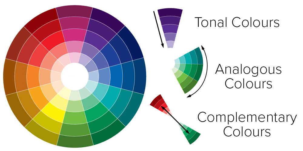
So you've got your palette, you're feeling brave, and now you want to give colour blocking a go. Which colours should you choose within your palette? Our three simple steps to colour blocking will lead you through from the simplest and most classic version through to bold, bright and beautiful, without frightening you away from your brights for life!
* STYLE NOTES *
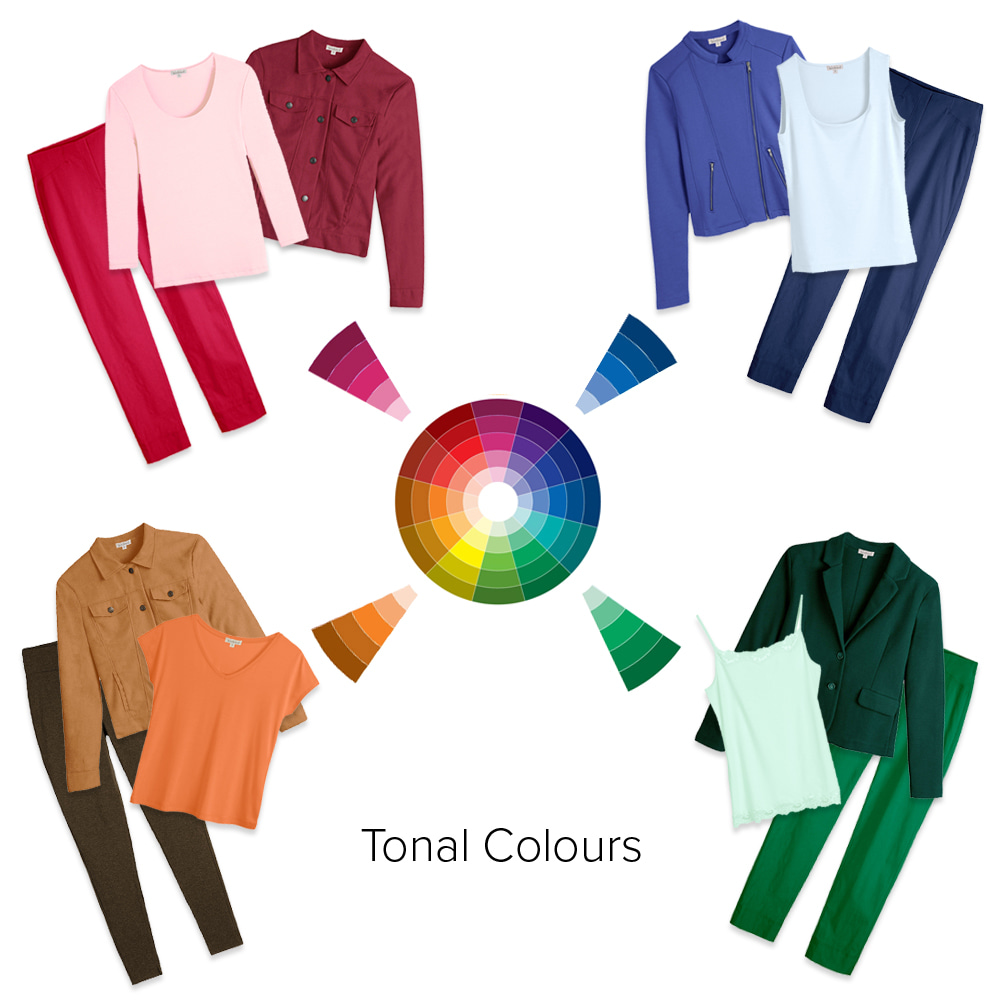
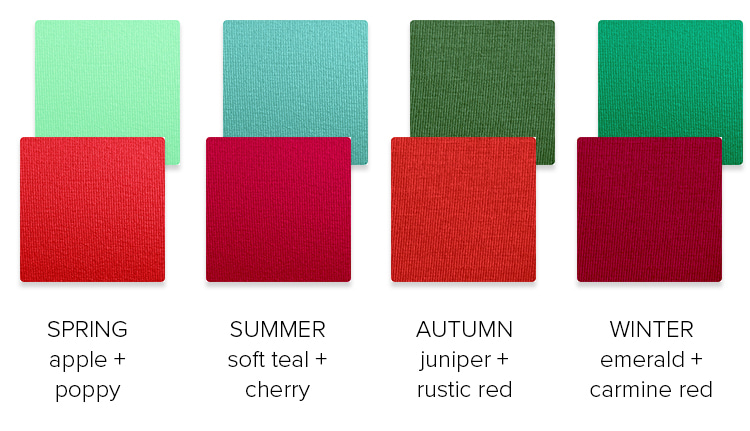
Opting for tonal colours is the simplest way to experiment with colour blocking. Even within the brighter seasonal palettes - Spring and Winter - opting for different versions of the same colour can look sophisticated while still carrying that colour blocking pop.
Pinks: Raspberry Roxy Shirt Jacket | Pink Ice Darcey Scoop | Magenta Rosa 7/8 Trousers
Blues: Bluebell Chloe Jacket | Ice Blue Soft Square Vest | Light Navy Rosa 7/8 Trousers
Greens: Deep Pine Winona Blazer | Mint Ice Lace Camisole | Emerald Rosa 7/8 Trousers
Oranges: Ginger Roxy Shirt Jacket | Mandarin Orange Cara V Neck | Chocolate Marl Leggings
* STYLE NOTES *
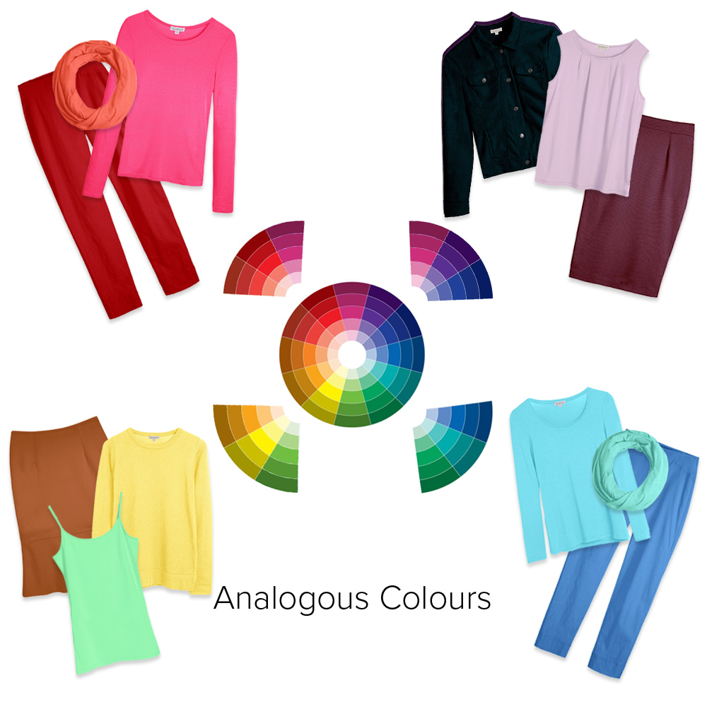
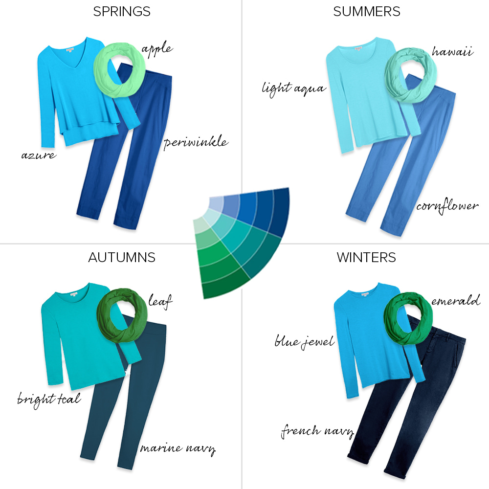
If you're ready to get a little bolder, then looking at analogous colours - ones that sit next door to each other on the colour wheel - is a great step up from tonal colours. Use your versions of combinations such as green and aqua, orange and yellow, and red and purple. Add in a third analogous colour for even more interest - more than that can be rather tricky though.
Clockwise from top left:
Shocking Pink Hetta Long Tee | True Red Rosa 7/8 Trousers | Coral Florence Infinity Scarf
Rich Navy Roxy Shirt Jacket | Chalk Violet Pippa Top | Soft Burgundy Ponte Pencil Skirt
Gingernut Ponte Kick Skirt |Sunshine Yellow Milan Knit Crew | Apple Long Camisole
Light Aqua Silky Scoop | Cornflower Rosa 7/8 Trousers | Hawaii Florence Infinity Scarf
* STYLE NOTES *
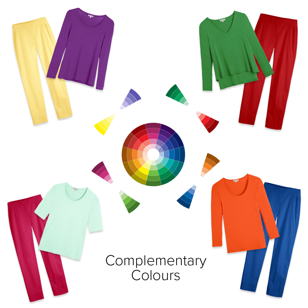
The ultimate in 'clashing but matching', complementary colours sit opposite each other on the colour wheel and create a bold, high impact colour blocking look while still sitting comfortably together. With versions of every colour within every palette, it should be possible to find a complementary combination for your seasonal palette.
Clockwise from top left:
Pansy Silky Scoop | Lemonade Rosa 7/8 Trousers
Leaf Lulu Layered Top | True Red Rosa 7/8 Trousers
Fiesta Orange Darcey Scoop | Periwinkle Rosa 7/8 Trousers
Mint Ice Scoop 1/2 Sleeve | Magenta Rosa 7/8 Trousers
How do I translate this to my seasonal palette?
The same guidelines apply to each of the seasonal palettes - just choose 'your' version of each of the shades shown for a similar look which flatters you and your natural colouring.
Springs: Lulu Layered Top | Rosa 7/8 Trousers | Florence Infinity Scarf
Summers: Silky Scoop Neck | Rosa 7/8 trousers | Florence Infinity Scarf
Autumns: Semi Scoop 3/4 Sleeve | Cotton Leggings | Florence Infinity Scarf
Winters: Silky Crew Neck | Reiko Chinos | Florence Infinity Scarf
Next level colour blocking
If getting hung up on a system doesn't feel right, simply be bold and try on combinations of your favourite colours! Colour blocking with your wow colours is always going to make you look amazing.
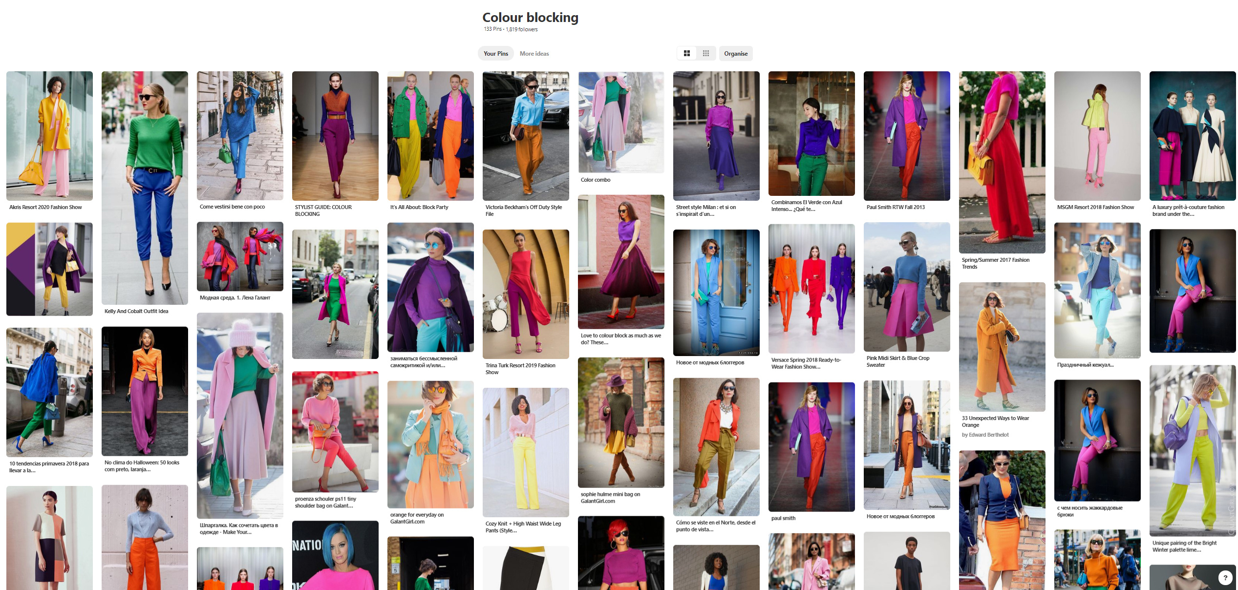
And for even more inspiration, why not find us on Pinterest?

Lisa Conlan on Mar 24, 2024 6:59 AM
Another great blog! So interesting and useful to know as I'm still quite new to colour combinations. I think I'll print off your colour wheel to put in my wardrobe. It would be really useful if resources like this could be pdf printable or we could purchase them on your website too 😁
Luce on Oct 12, 2019 11:57 PM
Fab article, thank you. Finally I understand how to put my colours together! Where can I get hold of a copy of the colour wheel? Just what is needed on my dressing room wall.
Jayne McClelland on Sep 15, 2019 7:45 AM
Thank you for this lesson its so helpful to see the actual colours with clothes. Genius.
Sheila Georges on Jul 21, 2019 11:29 AM
Brilliant lesson I found it most helpful. Thank you.
Una Daniel on Jul 20, 2019 5:59 PM
Brilliant article. Very easy to understand.
Many thanks.
Angela Price on Jul 20, 2019 2:10 PM
This is a great article. It has already helped me create new colour combinations with what I have in my wardrobe. I now understand how the colour wheel works.Many thanks Kettlewell.
Helen H on Jul 19, 2019 8:17 PM
Another really interesting colour blog. The blue/green analagous examples using the seasonal palettes are particularly gorgeous! I guess the secret is to keep within your palette, especially with complementary colours. As a BJW, I won't be using a blue/orange combination but Acid or Neon Yellow with some of the Winter purples looks stunning. Kettlewell does tonal dressing so brilliantly from deep to pastel that we're spoilt for choice.
I love colour-blocking and find that it's the added impact of colour no 3 that really does it! However, add a fourth and it's easy (for me) to slip into "aged parrot" - not a good look!
Many thanks, Jo.