Styling the Geri print for Springs
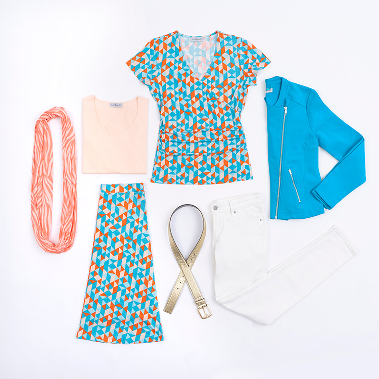
The Spring palette is warm, light, clear and bright, so it makes perfect sense that everything about the Geri print fits that bill too. Rather than add in too many colours, we opted for a simple contrast of warm oranges and peaches with gorgeously vibrant shades of aqua.
The Geri Skirt is a really simple but pretty shape, with an A-line flippy feel, but not so much fabric that it feels over the top. The top is a summer cap sleeved crossover with flattering ruching at the waist, making it hugely forgiving over a tummy area you’re feeling less than confident about.

Geri Crossover Top | Your own white jeans | Mid Cascade Wrap | Suede Tassel Bag
Style notes: I’ve kept this outfit really simple and classic, allowing the print top to do the talking, and showing how even the boldest prints can be styled in a classic, simple way.
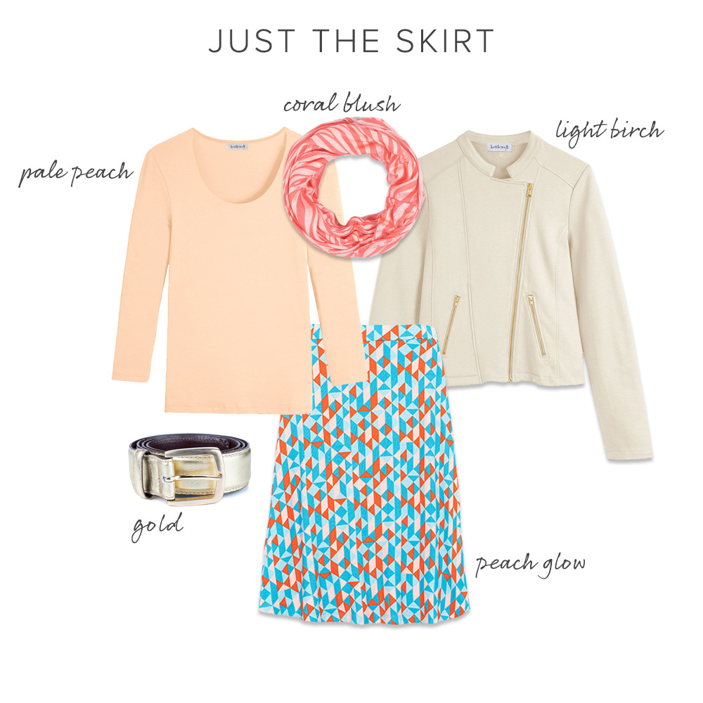
Style notes: We start to get a little bolder here, adding in a second print and a hint of metallic. In order to keep the look harmonious, I've paired these brights with Pale Peach and Light Birch on the top half.
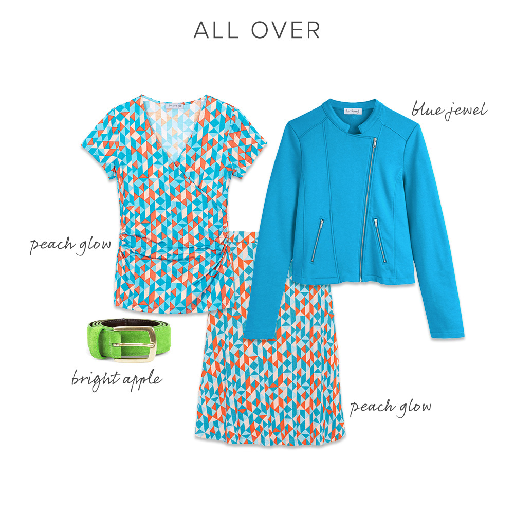
Style notes: When wearing the full co-ord as a dress, you could opt for all neutral accessories and layers, but I love the punchy Bright Apple here to add an extra colour pop. The Blue Jewel shows that it isn't necessary to precisely match the colours from a print for the outfit to feel pulled together and stylish.
To see how the other seasons style their Geri Print use the links below: