


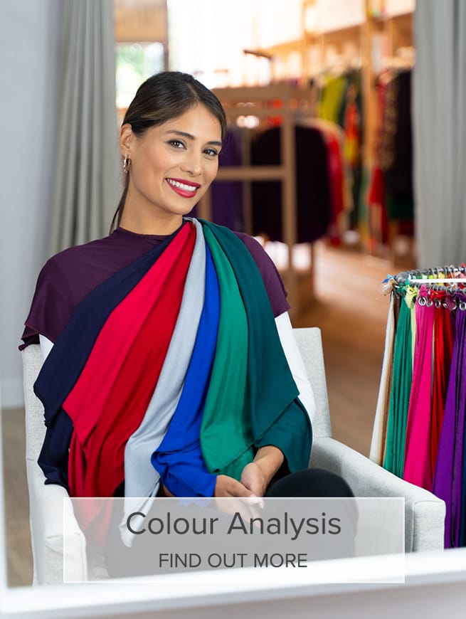
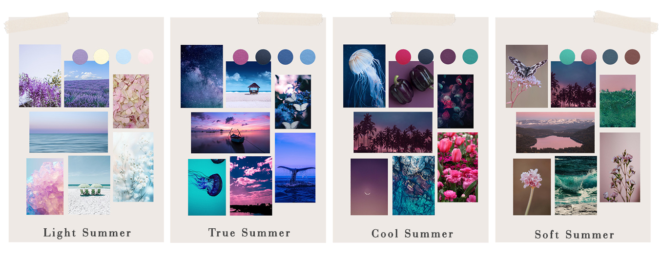
The Different Seasonal Sub-Types of Summers


The Summer Seasonal Colour Palette Explained
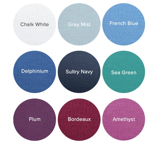
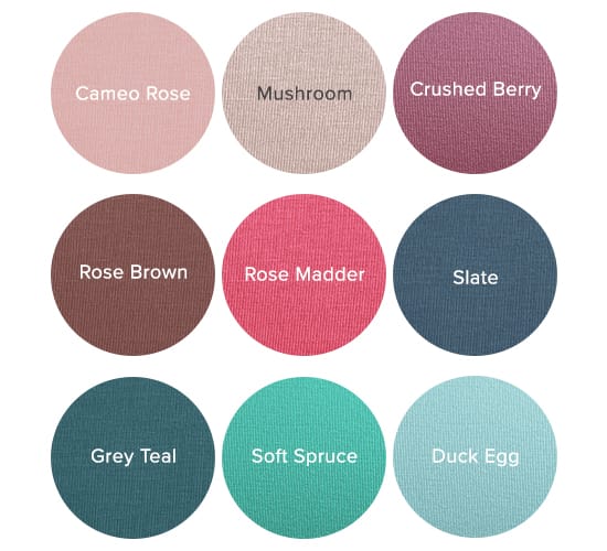
The Summer palette is soft, cool, smokey and subtle, and extends from deepest charcoal grey and darkest blue spruce tones all the way to softest pinks and powder blues. Knowing your seasonal sub-type means knowing which colours from this wider palette will best work for you, and give you guidance on the best way for you to combine colours to feel you most authentic, confident self.
Do remember though, that your seasonal type is a guide. If you fall at one end of a palette, it doesn’t mean you can’t ever go near colours from other areas of that palette, just that this particular area is the strongest part for your own skin tone and contrast level. Remember that the rest of the colours within your wider palette will also work for you and will harmonise with your absolute best colours.
Let’s explore the sub-types within the Summer palette, and discover how knowing your sub-type can open up even more amazing colours for you.
The True Summer Seasonal Colour Palette Explained
Also known as a Sweet Pea Summer, the True Summer (and their palette) has an even balance of Summer’s cool, soft and light characteristics.
True Summers often (although not always) look like the ‘classic’ summer - ashy mid-brown hair, grey or blue eyes, and skin that isn’t in high contrast with either hair or eyes. For all skin colours, there is generally not a great deal of contrast between hair, skin and eye colour - a black and white photo wouldn’t show extreme contrast here, and there is a softness which is overwhelmed by the strongest shades.
Because you sit right in the middle of the Summer palette - there is no ‘leaning’ towards any of the other three seasons, by being deeper, lighter, warmer or cooler - the best colours for these True Summers really are, very simply, the colours of the Summer palette! Cheating on your palette by shopping from colours in another palette is never going to work as well for you as one of the other types of Summers, who can push into their neighbouring season. The flip side is that you look the best in the widest range of Summer colours, as you really do sit bang in the middle of this palette. This means that it isn’t often helpful to add a tonal direction to the shopping filter on the Shop by Colour page, as adding in colours from other seasons rarely helps you - simply choose from the full Summer palette and you’ll never go far wrong!
You still have your own very best core of colours though. They are, unsurprisingly, the most definitively Summer colours. They can be any shade, from rose pinks to denim blues and pinky burgundy, but they share that equal balance of coolness, lightness and softness that you also hold.
When colour combining, the classic Summer guideline of layering tonal colours (not too much contrast, not too many different colours within one outfit) is usually the best place to start. If your outfit feels a little ‘much’ with a stronger colour, try wearing it more tonally - eg Periwinkle is paired with softer denim blues and blue-greys to anchor it.
The Light Summer Seasonal Colour Palette Explained

Also known as a Pastel or, rather whimsically, a Cotton Wool Ball Summer, the most noticeable characteristic of Light Summers is the lightness of their skin, hair and eye colour, although they still retain Summer’s cool and soft traits.
Light Summers are often fair, or have particularly light colouring for their ethnicity, across hair, eyes and skintone, and darker colours in clothes or hair dye look artificial and heavy on them.
Light Summer falls at the lightest, most ‘white added’ end of the Summer palette, and if you viewed all four seasons as one continuous spectrum of colour, then Light Summer would fall nearer to Spring than to Winter or Autumn.
Light Summer’s best colours are those with plenty of white added, and which often look like they might spill over into being Spring colours - the palest of yellows, light aquas, sky blues, and lavender purples.
When colour combining, the classic Summer guideline of layering tonal colours (not too much contrast, not too many different colours within one outfit) is usually the best place to start. Basing outfits around light neutrals can often be easier than going too dark.
The dominant tonal direction for this seasonal sub-type is Light, so you can visit Shop by Colour and filter for the Light dominant tonal direction for more colours which you might love (if you want to read more about how tonal directions relate to seasons, this post is a great starting point).
The Deep Summer Seasonal Colour Palette Explained

Also known as a Dark Summer or Bright Summer, the most dominant characteristic of Deep Summers is the depth of their look, more than the coolness or lightness of Summer (which they also hold, but to a lesser degree).
Deep Summers often look like they might be Winters, with strong colouring and deep brown or grey eyes. Hair is often dark, and skin can be any colour.
Deep Summer falls at the coolest end of the Summer palette, and if you viewed all four seasons as one continuous spectrum of colour, then Deep Summer’s colours would fall nearer to Winter than to Summer or Autumn.
Deep Summer’s best colours are usually deep, cool burgundies, soft navy, raspberry pinks and amethyst pinks.
Although most Summers suit a tonal look, you may well find that bringing a degree of contrast into your outfit makes you feel your best - mix darks and lights, or a bold pink or blue in with a more tonal look.
The dominant tonal direction for this seasonal sub-type is Cool, so you can visit Shop by Colour and filter for the Cool dominant tonal direction for more colours which you might love (if you want to read more about how tonal directions relate to seasons, this post is a great starting point).
The Soft Summer Seasonal Colour Palette Explained
Also known as Brown Summer, the most dominant characteristic of these Summers is the softness of their look. They still retain Summer’s coolness and softness, but softness is the predominant trait.
Soft Summers often look more like a classic Autumn, with red tones in their hair, hazel or brown eyes, and a hint of gold to their complexion. They can have a range of skin tones, but usually have very little contrast between their hair, eye and skin colour (if you were to take a black and white photo of them, their features would all have a similar tone).
Soft Summers sit at the less cool end of their palette, but unlike Light Summers, who sit near to Spring, Soft Summers sit at the Autumn end of the Summer palette (if you were to view all four seasonal palettes as a continuous spectrum). This means that although all of Soft Summer’s colours are cool toned, they are beginning to acquire hints of the warmth of Soft Autumn.
Soft Summer’s best colours have something of a feel of autumn to them, with rose browns and brown tinted pinks featuring heavily. Soft reds and berry tones also predominate.
When colour combining, the classic Summer guideline of layering tonal colours (not too much contrast, not too many different colours within one outfit) is usually the best place to start.
The dominant tonal direction for this seasonal sub-type is Soft, so you can visit Shop by Colour and filter for the Soft dominant tonal direction for more colours which you might love (if you want to read more about how tonal directions relate to seasons, this post is a great starting point).

About Kettlewell
Kettlewell is a British fashion brand dedicated to making it effortless for people to wear their best colours. Founded over 20 years ago near Chard, Somerset, it has grown from a small collection of seasonal T-shirts into the UK’s leading online colour retailer, offering over 300 carefully curated shades across a range of versatile styles. With a focus on confidence-boosting colour and timeless everyday fashion, Kettlewell helps people create wardrobes that bring them joy.

