Springs - The Seasonal Sub-Types
The Spring palette is warm, light, bright and fresh. But it also contains everything from almost autumnal cinnamon brown to wintery bright navy. If you've been given a designation within the Spring palette, let's explore what that means for you.
Do remember though, that your seasonal type is a guide. If you fall at one end of a palette, it doesn’t mean you can’t ever go near colours from other areas of that palette, just that this particular area is the strongest part for your own skin tone and contrast level. Sometimes a 12 or 16 season system can feel quite limiting in terms of the colours available to you, but remember that the rest of the colours within your wider seasonal palette will also work for you and will harmonise with your absolute best colours.
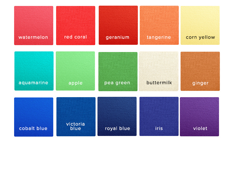
True/Golden/Warm Spring
This is probably the one we think of as a 'typical' Spring palette. The colours all have a definite warmth to them, and are clear and bright. Golden Springs often (although not always) look like a 'classic' Spring - their hair colour will be anything from bright red through strawberry to golden blonde, eye colour will be clear green or blue and their peaches and cream skintone has a real glow about it when flattered with the right colours.
A True Spring falls at the very warmest, most golden end of the wider Spring palette, and if you viewed the entire colour range of all four seasons as one continuous spectrum of colour, then True Spring’s colours would fall nearer to Autumn’s than to Winter’s or Summer’s.
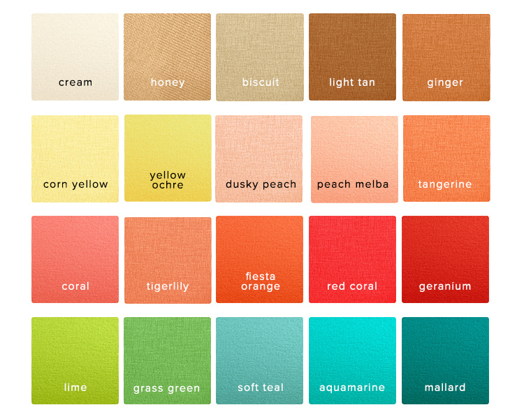
True Spring’s best colours are usually warm greens, yellows, orangey reds, very peachy pinks and every shade of light brown from tan to palest beige.
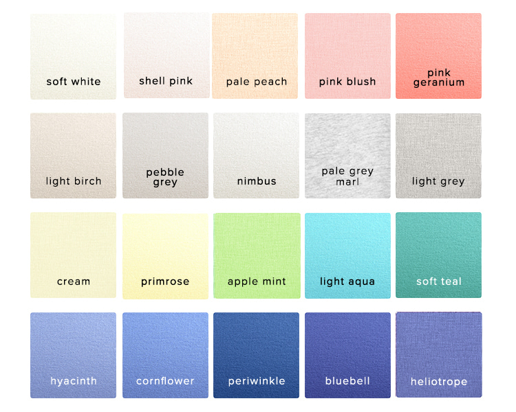
Light/Pastel Spring
This is the softest and lightest of the Spring colours - the intensity and saturation of those bolder Spring colours is really dialled down. Tints (colours with white added to make them lighter and clearer) feature heavily in this palette. The darkest of the Spring browns can often be too gloomy, with bright navy and dove grey making for better neutrals.
Light Springs often have very light clear eye colour, such as pale grey, blue or green, and hair that is usually fair and can look ashier than the golden tones of True Spring. If we were to put Light Spring's colours onto one continuous spectrum of all four seasons, its colours would fall towards the Summer end of the Spring palette.
Light Spring's best colours are (unsurprisingly!) the lightest Spring colours. Pale peach, light dove grey, palest mint green and aqua.
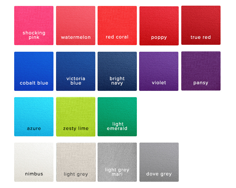
Bright/Clear/Blue Spring
Containing the most saturated and boldest of Spring's colours, with full on intensity and contrast. Those who fall into the Bright Spring category are often some of the trickiest to analyse - they can look like Winters, with piercingly bright eye colours, and often relatively dark hair with little or no warmth.
Bright Spring falls at the Winter end of the Spring palette, making it easy to see why the colours get clearer, brighter and less warm than those of the other Spring types.
Bright Spring's best colours are the bright blues and true reds, dove greys and more acidic yellows.
A note on Paintbox Springs
A classification used within the House of Colour analysis system, Paintbox Springs don't fall neatly into any of the categories above. It denotes someone who suits all of the strongest, brightest Spring colours, whether they are warmer or cooler. It falls somewhere between True Spring and Bright Spring, and high saturation is the key point to note for this seasonal type.
Let's talk about crossover colours
Once you understand seasonal types, the 'crossover' colours (those that apply to more than one season) at Kettlewell begin to make more sense. If a person sits at the 'end' of the Spring palette closest to Summer, it stands to reason that some colours will sit so close to that dividing line between Spring and Summer that the difference between them and the colour the other side of that dividing line will be indistinguishable to the human eye. If you are looking at crossover colours, consider which season the colours cross over with - if you are a light Spring, for example, those colours that work on both Springs and Summers will be your best crossover colours. Don't be afraid of trying other season crossover colours too though - if they apply to your palette, there's an excellent chance they will work on you. If you're feeling unsure, do give Kettlewell a call.
Crossover colours can be a tricky subject to get your head around, but once you begin to look at the entire spectrum of colours rather than each season in isolation, it starts to make perfect sense.
To read about the other seasons use the links below: