Colour conversation with journalist, Martha Roberts
Award-winning journalist Martha Roberts writes a monthly column for Psychologies magazine about colour, inspired by the The Colour File blog and Instagram account she started last year. Here, she talks colour combinations, the ‘right colours' and super-bright wardrobes.
When did your love affair with colour begin?
I can’t remember a time when I wasn’t obsessed with colour. My earliest colour memory is my second birthday cake which was white with dark purple 1970s icing. I remember thinking it was the most amazing thing I’d ever seen (and being very territorial about anyone else wanting any!). My mum said that from a very early age I’d be very specific about colour names: ‘What kind of blue is it? Sky blue? Royal blue? Maybe blue? [I was too little to say navy]’ The different shades and nuances of colour have always been important in my world. It’s as if no matter what has chopped and changed in my world, the thread running through has remained my love of colour. Colour is my constant.
What inspired you to start the Colour File blog and Instagram feed?
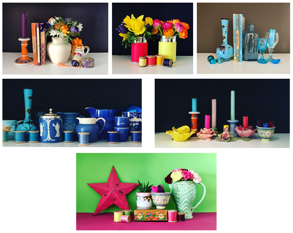
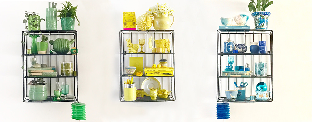
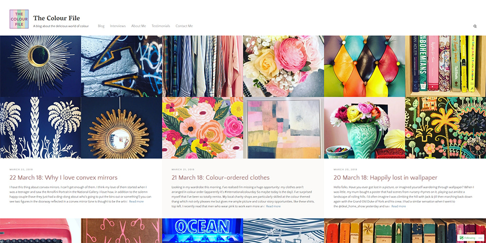
The Colour File came out of a mid-life conversation I had with Suzy Greaves, life coach and my editor at Psychologies magazine. She said it was important to connect with what I really ‘loved’ and I realized it was colour. I started to write the blog and I haven’t looked back. I use The Colour File as a place to wax lyrical about my love affair with colour, to investigate colour-related issues (such as statistics and studies) and to showcase my favourite colourful finds, whether through photographs I’ve snapped around the world or objects I’ve bought to place in my ‘shelfies’ (the inspiration for my book, Shelfie, which comes out in July 2018).
You have a colour column in Psychologies magazine all about colour and how it makes us feel. Can you tell us more about it?
Each month I take a colour and investigate how it makes us think, act and feel and an expert in the field of colour helps me to set readers a ‘colour challenge’ to see if ringing the changes and mixing things up will impact their lives in any way. However, the thing I’ve discovered about colour in relation to psychology is that it isn’t always definitive and straightforward: one person’s ‘feeling blue’ blue can be another person’s ‘ultra-positive’ blue. It depends on the individual and is also subject to cultural influences (for example, white may be a colour of celebration in some countries but the colour of mourning in others). There are rules and findings to do with the psychology of colour when it comes to branding and marketing (red, for example, is often used by fast food restaurants to increase appetite) but for me the beauty of colour and psychology is that it is, in many ways, individual. This very much goes along with my personal colour philosophy: ‘rules’ are made to be broken and it’s all about how colour makes you feel.
How does colour make you feel?
Colour makes me feel energized, alive and full of purpose. Having said that, the ‘wrong’ colours can make me feel the opposite: enervated, melancholy and deflated. When I was a little girl I had auburn hair so my mum always put me in ‘autumn’ colours – chestnut, brown and beige with a bit of green thrown in (to go with my green eyes). How I longed to wear cerise, purple and yellow but it didn’t happen until I was old enough to make my own buying decisions! I have avoided those sludgy colours ever since because they sap my life force! Over the years the ‘wrong’ colours have actually made me cry and the right ones have had me dancing with joy. To (kind of) borrow the words of Bill Shankly: "Some people think colour is a matter of life and death. I assure you, it's much more serious than that."
Do you have a favourite colour fact or anecdote?
Oh my gosh, where do I start?! Doing The Colour File means I’m discovering colour facts all the time and also mining my own personal history for colour memories. I love how magenta and solferino got their names (they were named after Italian battles) and the fact that medical scrubs are teal-coloured because after focusing so intently on the red of blood when they are operating, looking at the blue/green helps surgeons to focus by refreshing their vision of red (red and blue/green are complementary colours), thereby reducing the risk of surgical errors. The world of colour is full of interesting, quirky and clever stories.
Are there any names that inspire you in the world of colour?
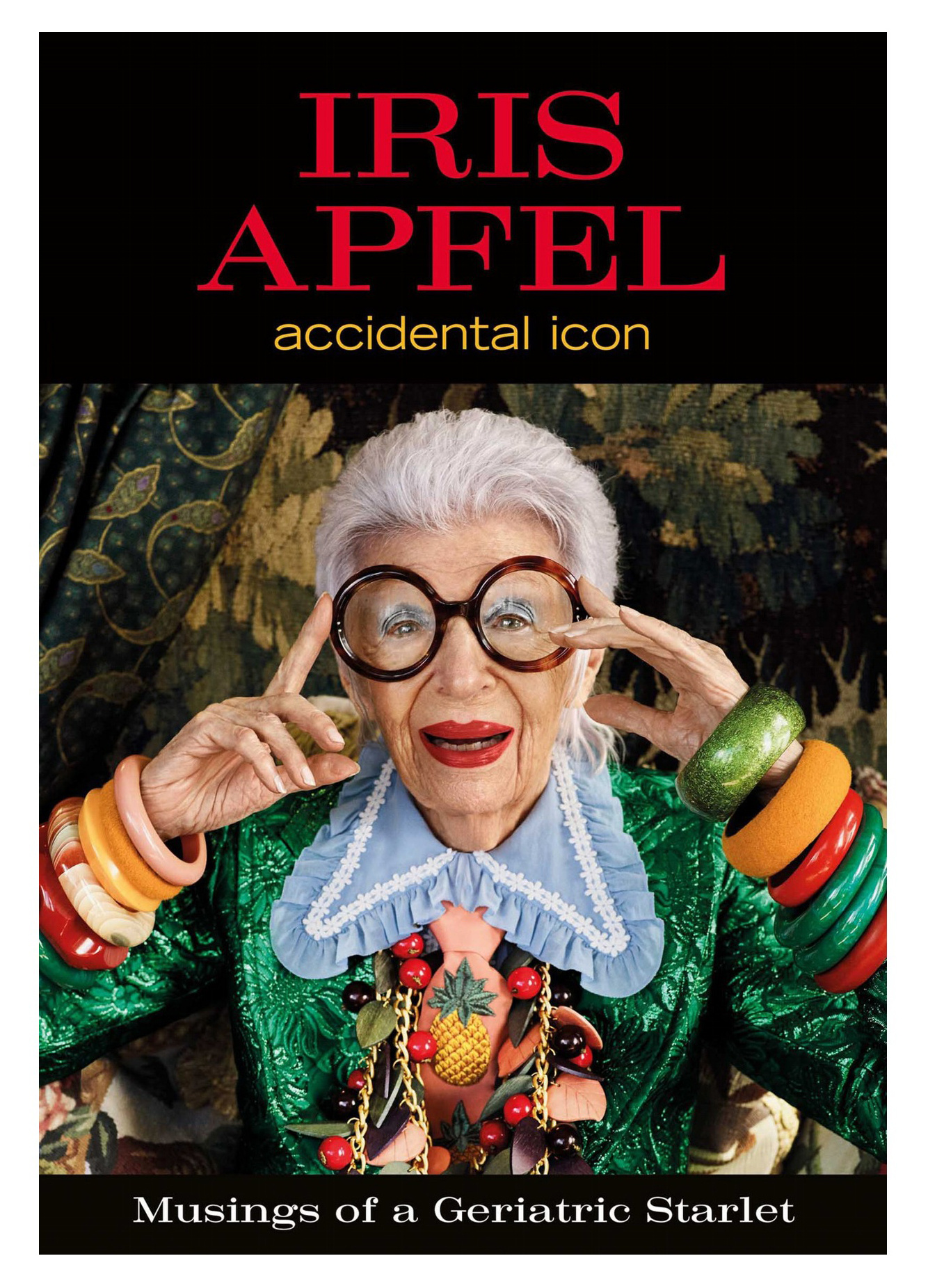
One of my biggest colour and style icons is Iris Apfel, an American stylist and style guru who is in her 90s and does exactly what she likes with colour. She mixes styles and colours with confidence and makes no excuses for it (she once said that ‘colour can raise the dead’). However, it’s often the use of colour by ordinary people or colour in ordinary and unexpected places that gets me most excited (like colours spray-painted on a pavement).
I have always secretly harboured a desire to have a job naming colours, whether it’s paint colours, nail polishes or fabrics. I often go into fabric departments and challenge myself to guess the name of the colour before turning the swatch over to see if I’ve got it right. I enjoy getting it right but I love getting it wrong, too, because that usually means I’ve discovered a new colour name. Honestly, I’m such a colour geek it’s untrue.
How does your home reflect your love of colour?
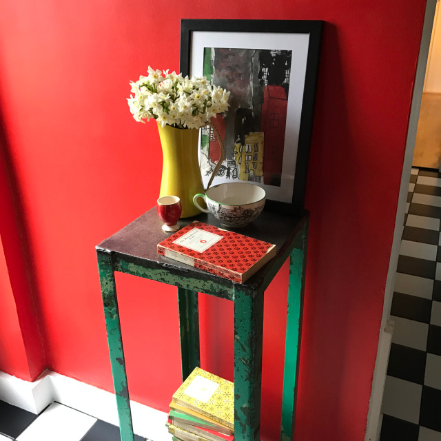
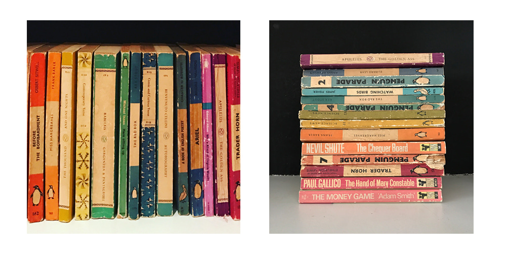
As you can imagine, my home is crammed full of colour, both in terms of the wall colours and the things I fill it with. I will generally buy things for their colour so over the years I have ended up with some strange things, like a picture of beetles that I got from Grand Central Station in New York four years ago because of the pastel-coloured inks it was drawn with and a vintage potty because I love the pink and black Art Deco-style colours together. I also buy books for their colours because they ‘go’ with shelfies that I’ve been planning (they end up being put in colour order on my shelves after that). I’m always mixing things up so it may be that if you come to my house it won’t look like how it did a few months before. It’s not about boredom as much as having this burning need to try new visual effects.
How bright is your wardrobe, and what shades do you gravitate towards?
My wardrobe is super-bright with so many colours in it. As well as the High Street, I often shop in charity shops so I end up buying items of clothing in colours that hadn’t necessarily crossed my mind before (the price point gives me permission to ‘get it wrong’) and that is definitely reflected in what you see when you open my wardrobe door! For example, I’ve got a shiny mint green Marni blouse and a block colour geometric top from the 1980s (I took out the shoulder pads because they were a tad too much…) sitting alongside electric blue palazzo pants from Zara and floral dresses from Warehouse. I also have a gazillion coats and scarves because I just can’t stop buying them. I honestly couldn’t say there are shades I gravitate towards because pretty much everything is on my radar. However, I tend to avoid grey because I’m not that keen and also I don’t think it does anything for me.
Last great colourful buy?
I was in New York recently and I bought a pair of bright yellow Zadig & Voltaire trainers with a white and gold flash along the side – they are delicious! Since buying a yellow cardigan by Danish designer Sibin Linnebjerg a couple of months ago, I’ve been wearing so much yellow and loving the way it makes me feel: full of the joys. I had a friend who jokingly used to say that ‘Only Doris Day can wear yellow’ but I have decided that she’s wrong, wrong, wrong!
Tricky question, we know, but if you had to pinpoint a favourite shade, what would it be?
Now that IS a tricky question! I’m often asked what my favourite colour is and although my four-year-old self would have said purple, I’ve come to the conclusion that it’s combinations of colours that do it for me: pink and green; pink, green and yellow; pink, green, purple and yellow. I have favourite shades of different colours - cerulean blue, spring green, millennial pink, bright yellow – but it’s definitely combinations of colours that make me happiest.