Colour conversation with Gabriella Winters, Production Designer and Colour Analyst

When and how did your love affair with colour first develop?
So, I’m a set designer by trade and my love for colours developed early on in my career when I was designing for films. I used to spend days tweaking the colour palettes for a project because I wanted to be able to evoke particular feelings and emotions, get specific reactions from the audience and tell an elaborate story even before any dialogue began. When designing each set, colour was my tool of manipulation if you like.
My fascination with colour was addictive so I ended up training in colour psychology as well as colour analysis to deepen my knowledge and experience with the topic. I wanted to be able to turn the very same space vibrant or dull, scary or welcoming; and the ability to make the same character appear ill or healthy, gorgeous or average, accomplished or a nobody, as and when I pleased. And colours enabled me to do all that.

Can you tell us about your background and what led you to setting up the Chromology system of colour analysis?
When I first trained in colour analysis, I didn’t have the intention of seeing colour clients, my goal was solely to apply the knowledge in my set design work. However my qualification required a lot of ‘client’ practice and it was during one of those ‘practice sessions’ when I had a complete change of heart.
I remember so clearly, at the end of the session, this lovely client bursting into tears of pain and joy all at once. Because she “couldn’t remember the last time she felt so beautiful”. And it was at that very moment, when I realised just how powerful this work is. To be able to show women (and men!) just how beautifully designed they are already, and give them the tools to be able to extend themselves in an striking yet fully authentic way. You could say I recognised my ‘true calling’ in that moment.
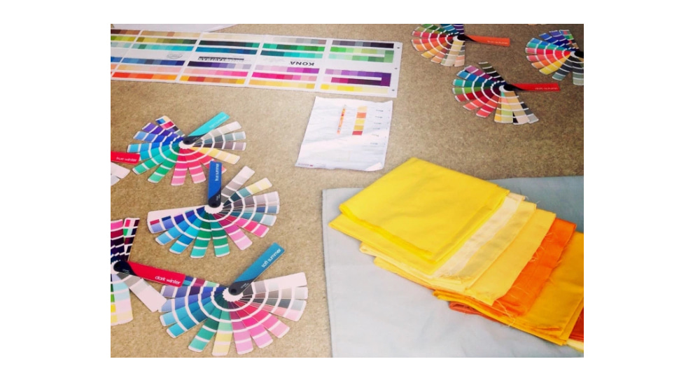
Tell us about your colour training. Why did you choose this particular method?
I trained in the Sci\ART method under Terry Wildfong in Michigan, US. I chose Sci\ART because the colour harmonies made the most visual sense to my design trained eyes and the technical explanations of how and why the process works were able to satisfy my ever so inquisitive science-geek brain. ‘Blonde hair + blue eyes = summer colouring’ was just not a logical or detailed enough explanation style. After all, colours are just reflections of electromagnetic energy, so for me it was important to find a school of thought that approached human colouring more objectively and could back up their teachings with science.

How does colour make you feel?
Tremendously fascinated. Each colour evokes something different in me. Sometimes, even the very same colours can have different effects on me if the context is modified, so colour as an experience is forever intriguing to me. You can often catch me ‘playing’ with colours as if they were pieces of Lego.
You’re a self-confessed science geek. How does that manifest itself?
Well I’m the kind of girl who likes reading science journals instead of glossy magazines. I get completely absorbed by topics about patterns and algorithms in nature and how everything works and fits together inside our universe. My recent ‘bedtime books’ included genres such as cell biology and quantum mechanics. I guess my geekiness would explain my science based approach to personal colour analysis as well.
Are there any colours you particularly dislike?
Hmmm… that’s a tricky one because in the right context any colour can look mesmerisingly beautiful and appealing to me. For that, I find the quote from Eugène Delacroix, french artist, very fitting:
“I can paint you the skin of Venus with mud, provided you let me surround it as I will.”
In general though, I’m probably least drawn to colours that can be described as dusky or dusty, but that’s probably because my energy is best balanced by clearer, more vibrant jewel tone colours.
How have your clients' lives been changed by analysis?
Immensely. The most typical response I get from a client after their consultation, is that they didn’t think they’d be able to see so clearly the differences between the effects of the various colours. Being able to see with your own eyes, the effects of bad, okay, good and excellent colours on your skin is absolutely key in order to achieve a visible transformation.
“If you see a newsreader on TV, it's almost guaranteed that they will have been "done" [had their colours analysed]. And when my friend Andrea, her husband, and their young son started looking like themselves only better, I knew something was up. Andrea duly referred me to the secret of her family's glowing new look: Gabriella Winters at Chromology.” - Kat Brown, Glamour Magazine

How colourful is your home?
Hahaha, not very colourful actually. Ironically, I like to be surrounded by neutral toned environments with only a few colourful accents.
Great last colourful buy?
This is probably not going to sound that exciting, but I’m very thrilled about my recent acquisition of a pair of Brooks Ravenna trainers. It can be harder than it seems to find a pair of running shoes in your best colours, in a style you like, and one that’s also comfortable and feels ‘just right’ for your feet.
If you had to pinpoint a favourite colour, what would it be?
Oh, I think my favourite colours would have to be indigo, fuchsia and turquoise. They tend to catch my eyes and draw me towards their energies when I’m near them.

Jane on Jun 09, 2022 7:30 PM
Is Gabriella the only Sci/ART trained analyst in the UK?